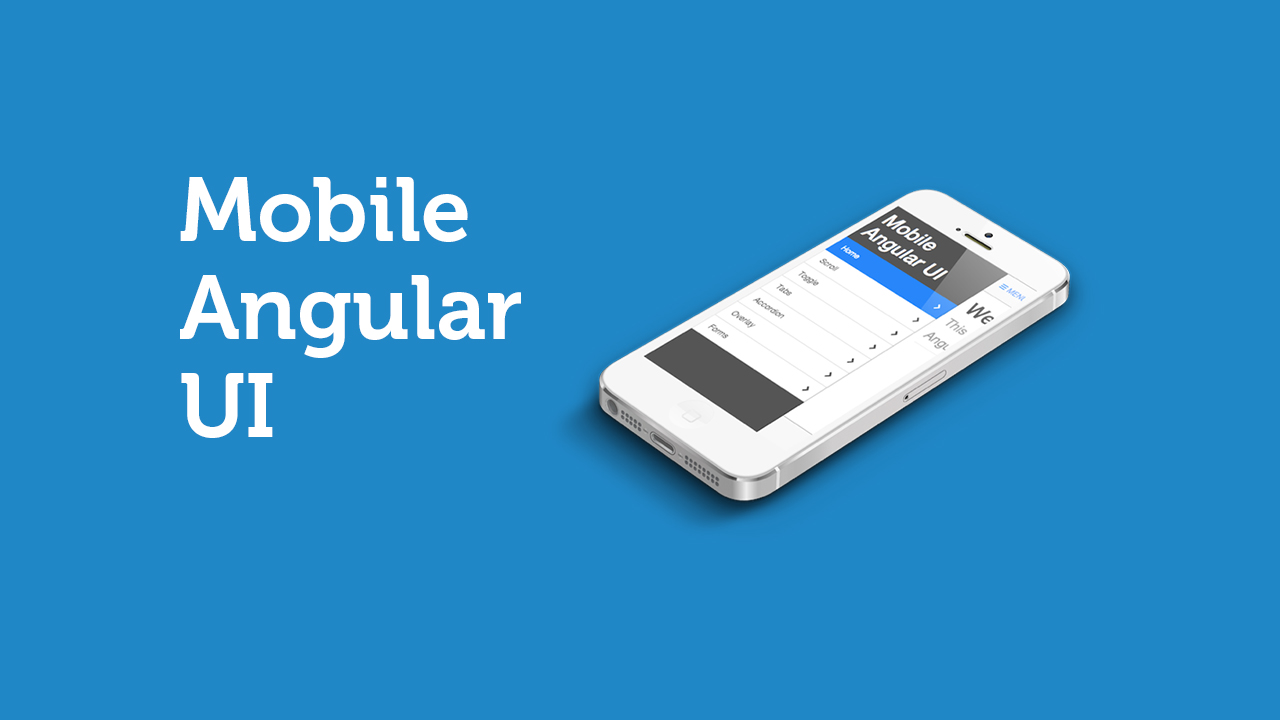
Mobile Angular UI provides essential mobile components that are missing in Bootstrap 3. These components are switches, overlays, sidebars, scrollable areas, and absolute positioned top and bottom navbars that don’t bounce on scroll. This is because it relies on robust libraries like fastclick.js and overthrow.js to achieve the better mobile experience.
All posts filed under “User Interface”
All the User Interface-related tutorials, ideas and various posts in Stampede Constructs
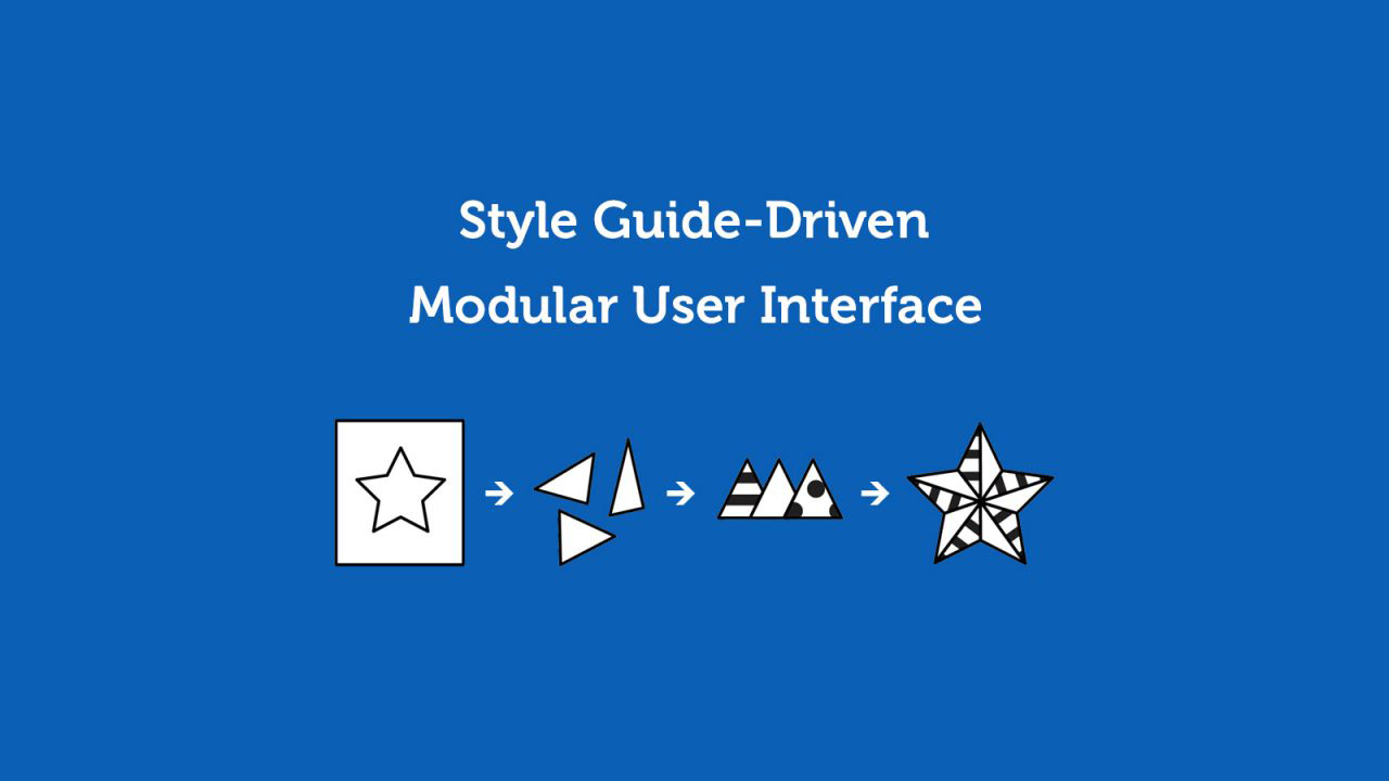
Style Guide-Driven Modular UI
Recently, our team discussed heavily on style guides. When and How to implement style guides? Why is it important to have style guides? Is it only applicable for the design team only, and what about developers and managers? But let’s take a step back and look into what a style guide actually is?
Developers, Start Learning User-centered Design
In the past, it was commonly believed that only designers should only involve themselves in user-centered design and that developers would only build the functionality of these designs. However, times have changed and developers should also learn to understand users and implement this mentality in their work.
Read More
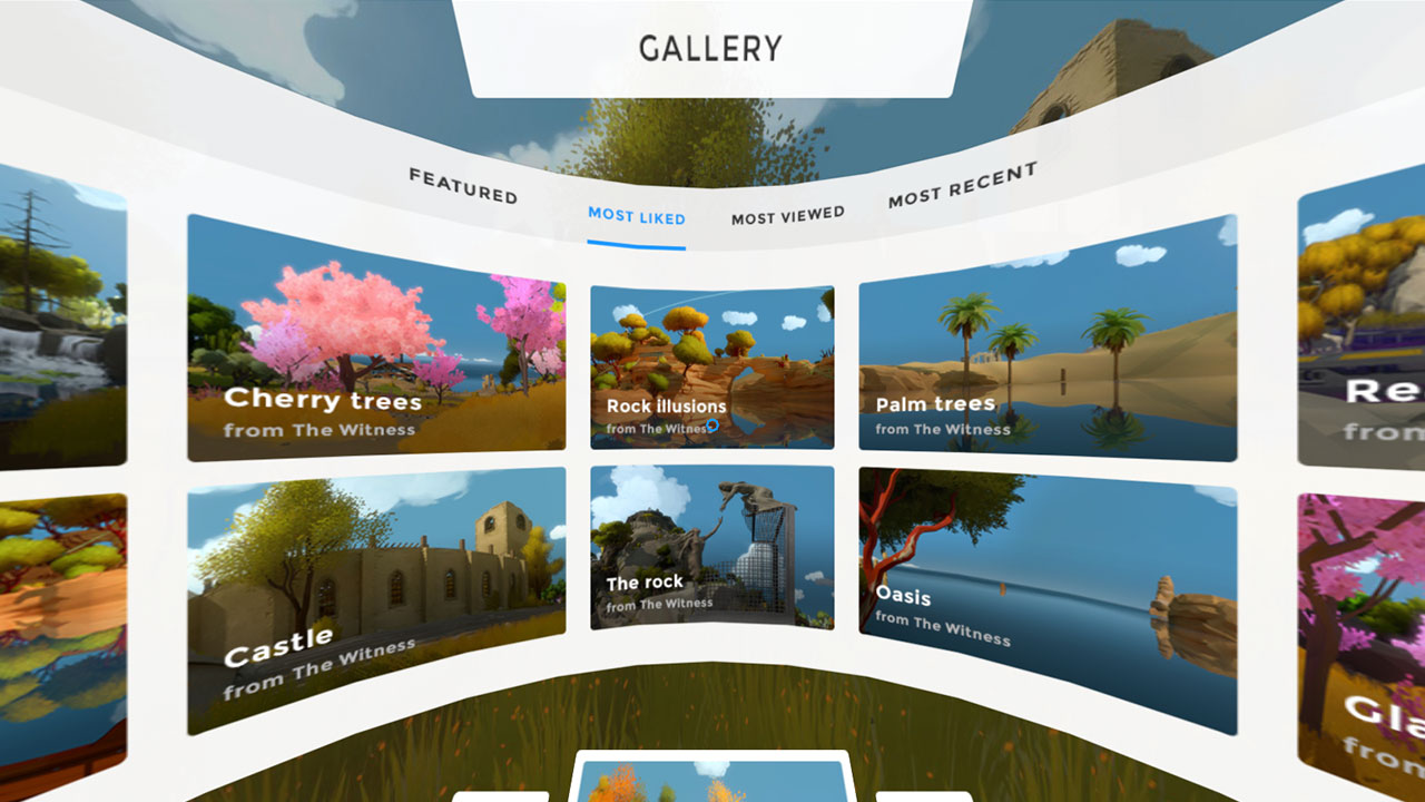
VR Interface Mockup to Paint the Future of the Web
The way we use the Internet is through everyday computing devices. This comes in the form of both desktop computers and mobile gadgets (tablets and smartphones). Enter Vincent Munoz from vincentmunoz.fr. He has created an interesting mockup on how you could explore the Internet with the use of virtual reality. You can move around using WASD on your keyboard and shift your view using your mouse.
Read More
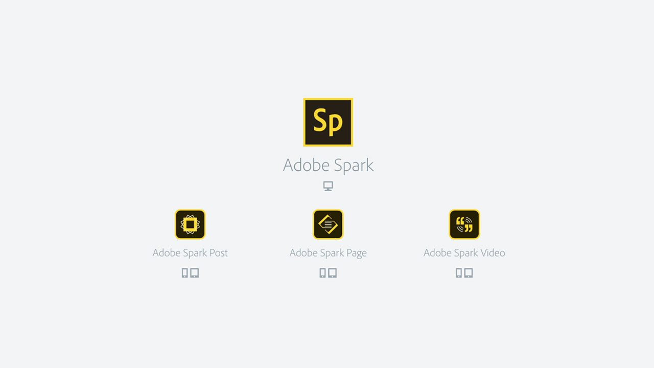
Adobe Spark is Here!
Adobe has just launched its news suite called Adobe Spark! It was launched last night (local time) and we think it’s big and useful! On mobile, it is actually an upgrade of the three apps that Adobe has been operating.
How to Create a Slack Interface for Your PHP Application
10 UX/UI Tools for Developers
Prototyping is building a simulation of how a completed project will work. It allows designers to show how an entire application will function. This process is very good to explain functional mechanics to the team developing the product and also for stakeholders to understand what they are getting. In not so many words, it’s used illustrate how a final product will look and perform.
Exploring the Mall in 3D
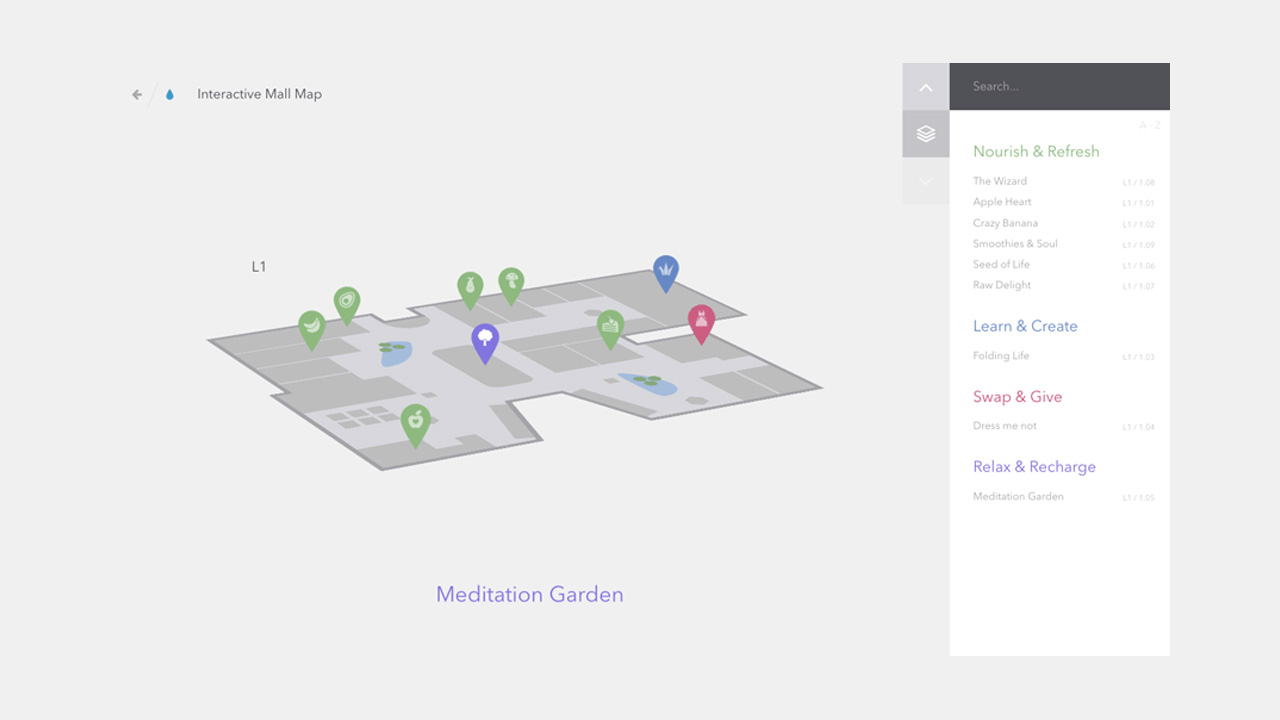
Ever found yourself stuck in a mall waiting and you noticed an interactive digital directory to toy with? Instead of actually trying to find a location, you end up just fiddling with the UI to test its functionalities and response time. You’re not the only one, welcome to the group! We’ve found ourselves doing the exact same thing.
Codrops has come out with an attractive Interactive 3D Mall Map. We fell in love with this immediately due to it’s clean visuals and smooth transitions, definitely something to take a look at.
Take note however, the writer Mary Lou has mentioned that:
This is a highly experimental proof-of-concept. 3D and viewport units support is needed for this to work.
Ink Transition Effect
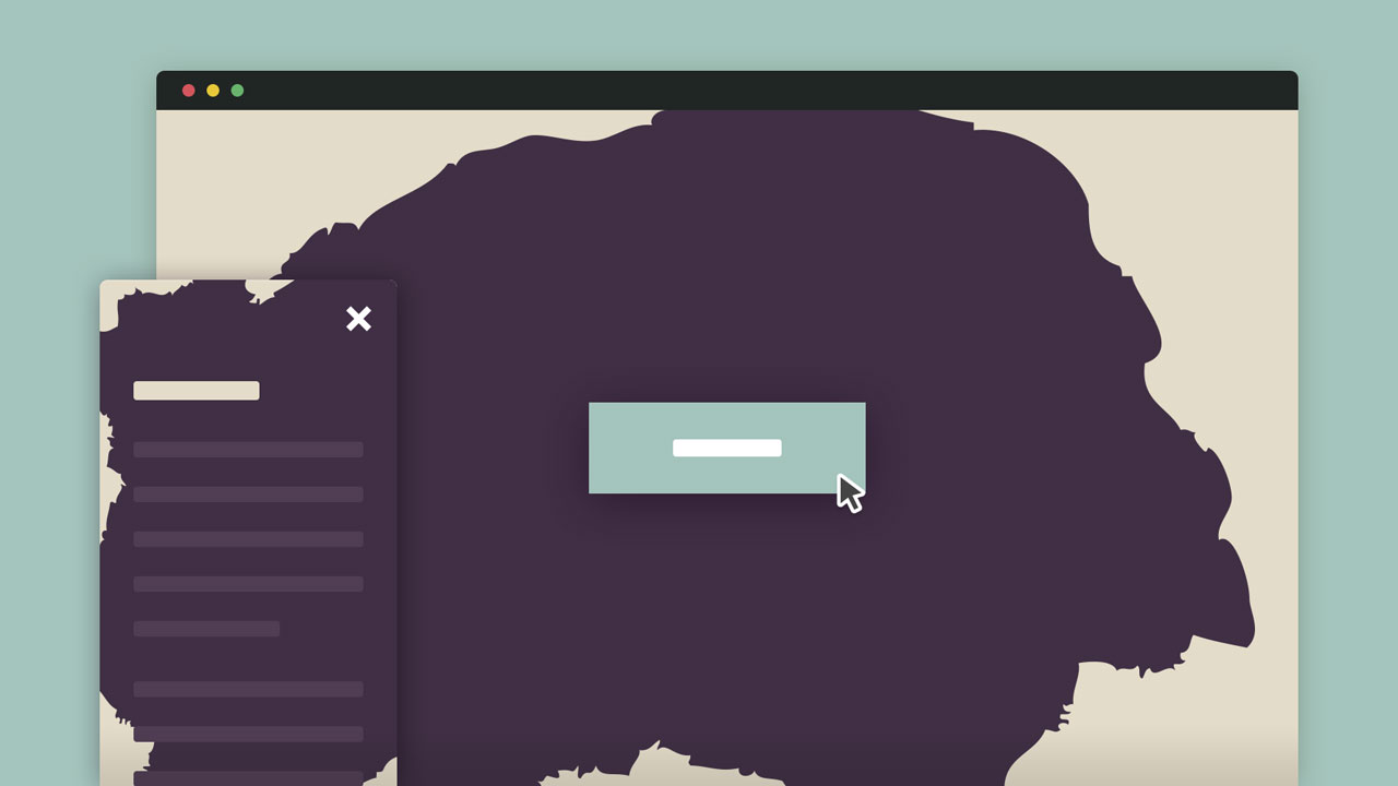
Transitions maketh Interaction. Any website or mobile application without any transition would seem dull. The complexity of transitions can be as simple as a fade-in effect to something complex like the Call of Duty: Ghost loading UI Interface . Here’s an Ink transition inspired by Sevenhills, Claudia Romano has said :
“By using a PNG sprite and the steps() timing function in CSS, we can create video effects and use them as transitions”.
So what are you waiting for? Hop on the Transition train for a better future! Hola us for any ideas and comments on transitions!
Google Resizer
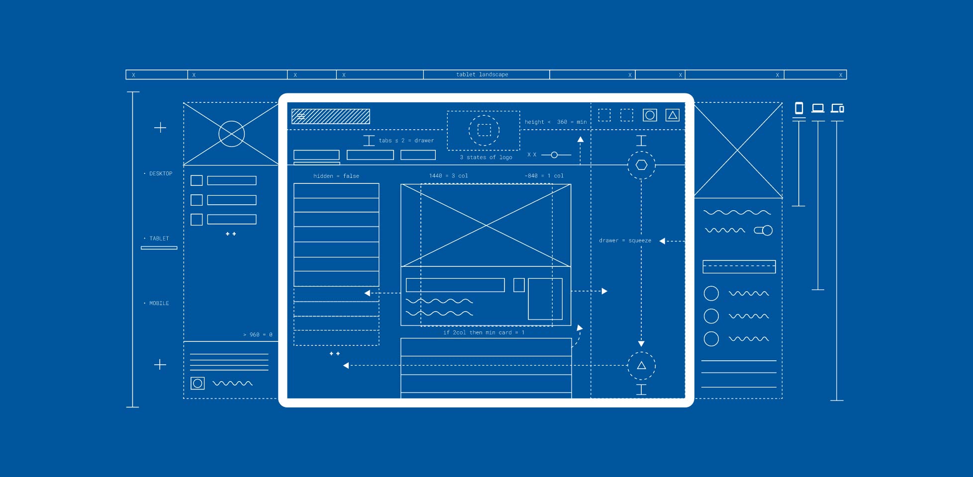
You’re probably already familiar with responsinator, a tool to check a webpage in a variety of viewports. Google is now offering an alternative by the name of Resizer which is made to test Google’s very own Material Design across many different platforms. A number of breakpoints can be tested.
Desktop: 480px, 600px, 840px, 960px, 1280px, 1440px, or 1600px
Mobile: 360px, 600px, 720px, or 1024px wide
 Stampede Design