 Stampede Design
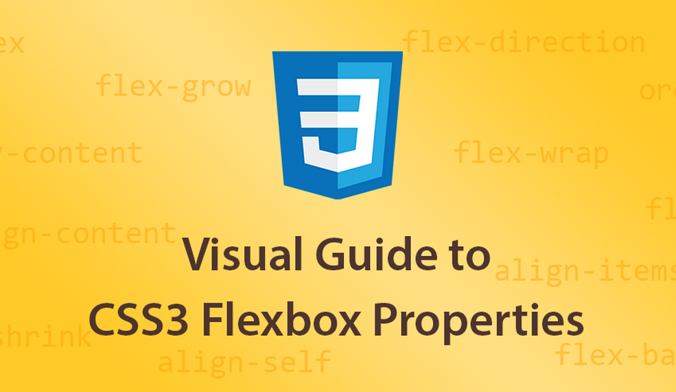
One of the new features of CSS3 is the Flexbox Layout, officially called CSS Flexible Box Layout Module which was designed for laying out more complex applications and webpages. Flex layout is superficially similar to block layout. It lacks many of the more complex text- or document-centric properties that can be used in block layout, such as floats and columns. In return it gains simple and powerful tools for distributing space and aligning content in ways that webapps and complex web pages often need. The contents of a flex container:
- can be laid out in any flow direction (leftwards, rightwards, downwards, or even upwards!)
- can have their display order reversed or rearranged at the style layer (i.e., visual order can be independent of source and speech order)
- can be laid out linearly along a single (main) axis or wrapped into multiple lines along a secondary (cross) axis
- can “flex” their sizes to respond to the available space
- can be aligned with respect to their container or each other
- can be dynamically collapsed or uncollapsed along the main axis while preserving the container’s cross size
For a more visual guide to the CSS3 Flexbox properties, check out this Scotch.io article by Dimitar Stojanov with the accompanying demo.