 Stampede Design
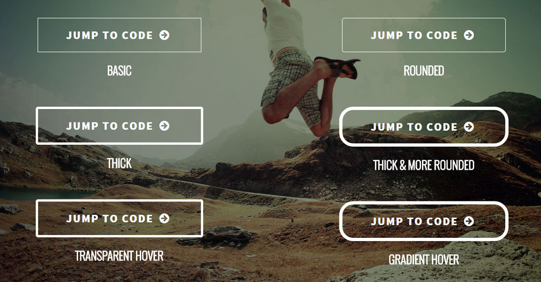
Have you heard about ghost buttons? This is perhaps a common term for designers and you probably have seen a ghost button in action without knowing one. The ghost button first gain traction and became a trend in 2014.
So what is a ghost button? The most basic and common ghost buttons style is a transparent button with solid white border and white text. The padding is often generous and border thickness varies depending on the design style. Due to the transparency, whichever image or elements behind it will naturally become the background of the ghost button. This is popularly used as the call-to-action for hero images (often huge banner at the very top of your page) or as a more minimalist alternative to huge, blocky, high-contrast buttons that are trying too hard (according to our Stampede designers!).
Alright, let’s build one!
A ghost button can also be styled in many ways. You can give it rounded corners by using the border-radius property, apply different color for text and border or give contrast or transition on mouse-over. Building one is pretty simple too. Let’s start with the markup and then we’ll look deeper into the CSS properties.
HTML
<div class="container cf"> <h1>Dare To Jump?</h1> <div class="left"> <a href="#" class="btn-1">Jump to code <i class="icon-right-circled"></i></a> <p>Basic</p> </div> <div class="right"> <a href="#" class="btn-2">Jump to code <i class="icon-right-circled"></i></a> <p>Rounded</p> </div> <div class="left"> <a href="#" class="btn-3">Jump to code <i class="icon-right-circled"></i></a> <p>Thick</p> </div> <div class="right"> <a href="#" class="btn-4">Jump to code <i class="icon-right-circled"></i></a> <p>thick & more rounded</p> </div> <div class="left"> <a href="#" class="btn-5">Jump to code <i class="icon-right-circled"></i></a> <p>transparent hover</p> </div> <div class="right"> <a href="#" class="btn-6">Jump to code <i class="icon-right-circled"></i></a> <p>gradient hover</p> </div> </div>
CSS
	* {
		padding:0;
		margin:0;
	}
	.cf
	{
	*zoom:1;
	}
	.cf:before, .cf:after
	{
	display:table;
	content:'';
	line-height:0;
	}
	.cf:after
	{
	clear:both;
	}
	.left {
		float:left;
	}
	.right {
		float:right;
	}
	body {
		font-family: 'Source Sans Pro', sans-serif;
		text-transform:uppercase;
		text-align:center;
		color:#fff;
		background:url("../image/construct-ghost-button.jpg") no-repeat center center fixed;
		-webkit-background-size: cover;
		-moz-background-size: cover;
		-o-background-size: cover;
		background-size: cover;
		padding:50px 0;
	}
	.container {
		width:80%;
		margin:0 10%;
	}
	.container > div {
		width:40%;
	}
	h1 {
		font-family: 'Oswald', sans-serif;
		font-size:100px;
		font-weight:300;
		margin-bottom:100px;
	}
	a {
		color:#fff;
		font-size:24px;
		font-weight:900;
		text-decoration:none;
		letter-spacing:2px;
		border:1px solid #fff;
		padding:20px 60px;
		margin-bottom:20px;
		display:inline-block;
	}
	p {
		font-family: 'Oswald', sans-serif;
		font-size:24px;
		font-weight:900;
		margin-bottom:60px;
	}
	.btn-2 {
		border-radius:5px;
	}
	.btn-3, .btn-5 {
		border-width:5px;
		border-radius:5px;
	}
	.btn-4, .btn-6 {
		border-width:7px;
		border-radius:30px;
	}
	.btn-5:hover {
		background:rgba(81,112,159,0.5);
	}
	.btn-6:hover {
		background:#243432;
		background: -webkit-linear-gradient(#243432, #3d8e77); /* For Safari 5.1 to 6.0 */
		background: -o-linear-gradient(#243432, #3d8e77); /* For Opera 11.1 to 12.0 */
		background: -moz-linear-gradient(#243432, #3d8e77); /* For Firefox 3.6 to 15 */
		background: linear-gradient(#243432, #3d8e77); /* Standard syntax */
	}
	@media screen and (max-width: 1200px) {
		.container > div {
			width:100%;
		}
	}
Hopefully this article will help you creating ghost button.
Pingback: Ghost Buttons - Website Design in 2015