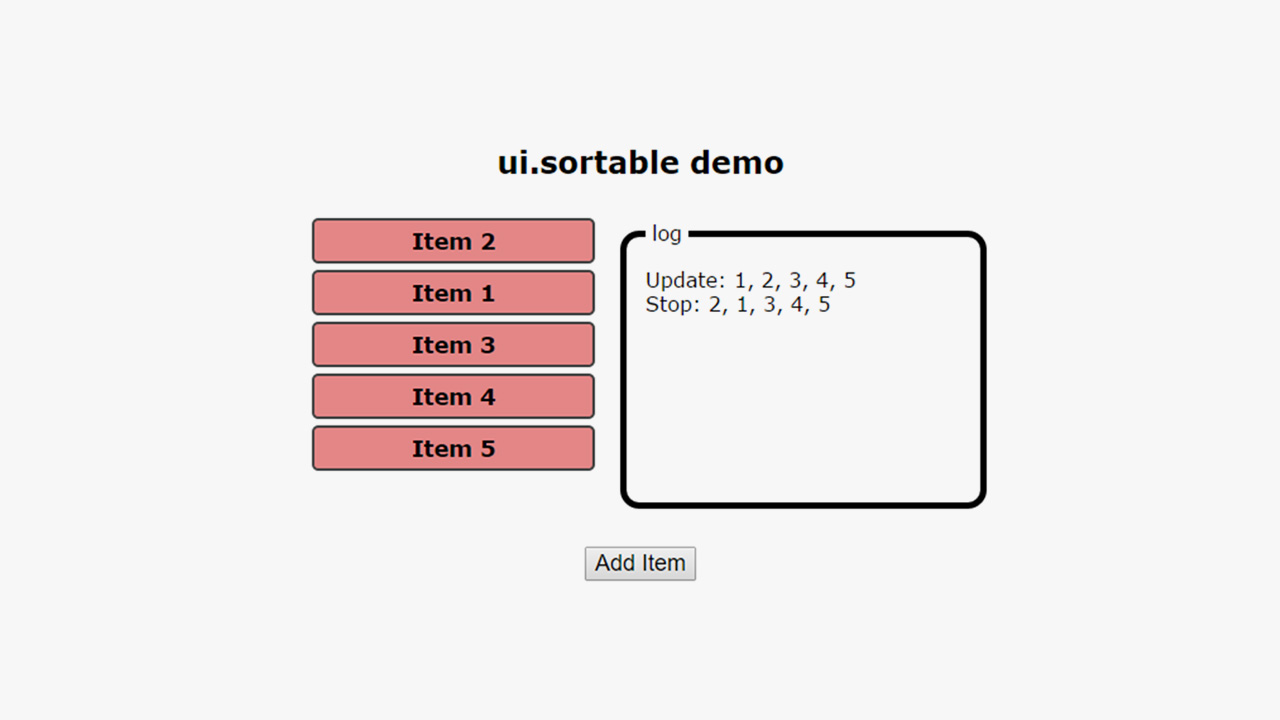
If you come from a strong jQuery background and are new to AngularJS, you might have seen the following. AngularJS-compatible plugins that have been ported from jQuery. Now you wonder, why do I need an “Angularized” version of a standard jQuery plugin? I didn’t take this question seriously too when I first started out with AngularJS.
All posts tagged “#UI”
All the UI-related tutorials, ideas and various posts in Stampede Constructs
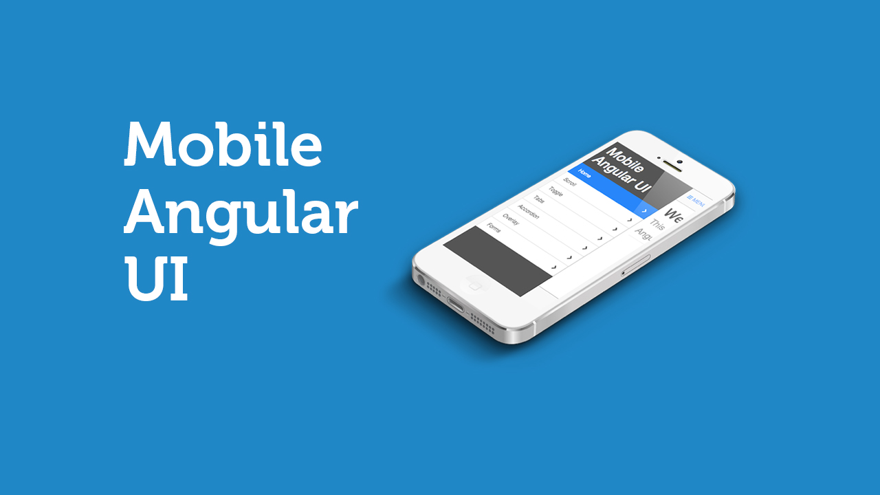
Mobile User Interface for Angular.js
Mobile Angular UI provides essential mobile components that are missing in Bootstrap 3. These components are switches, overlays, sidebars, scrollable areas, and absolute positioned top and bottom navbars that don’t bounce on scroll. This is because it relies on robust libraries like fastclick.js and overthrow.js to achieve the better mobile experience.
Google Resizer
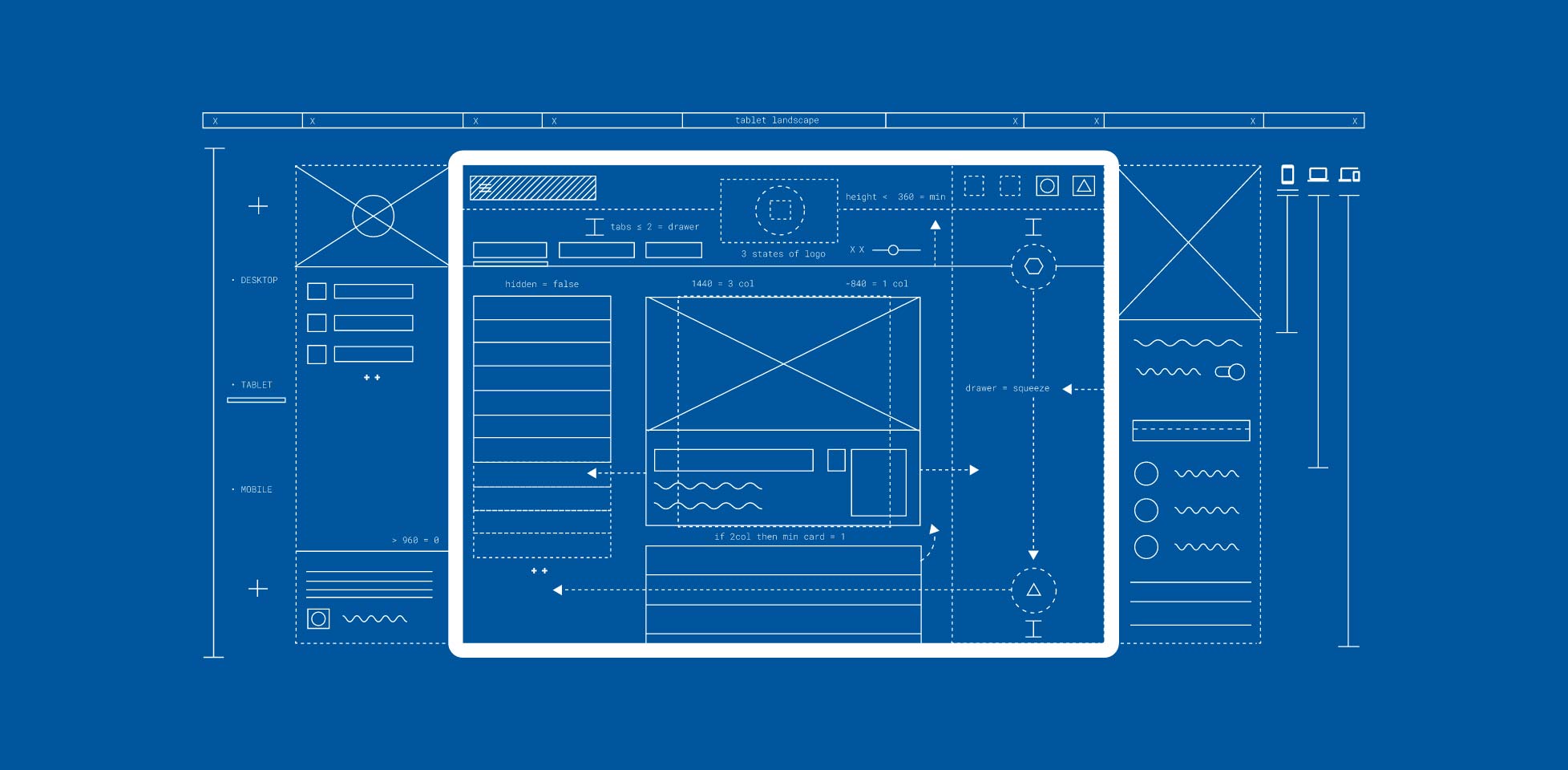
You’re probably already familiar with responsinator, a tool to check a webpage in a variety of viewports. Google is now offering an alternative by the name of Resizer which is made to test Google’s very own Material Design across many different platforms. A number of breakpoints can be tested.
Desktop: 480px, 600px, 840px, 960px, 1280px, 1440px, or 1600px
Mobile: 360px, 600px, 720px, or 1024px wide
Minimal Responsive Newsletter Form
Getting a user to subscribe to a website’s newsletter mailing list is always the most challenging part. IMO, the key is where you position the call-to-action form. Then there’s the UI and UX of the newsletter form itself. When user decides to subscribe, we need to make sure the process is flawlessly smooth and simple. Claudia Romano and her team started experimenting with some subtle CSS3 animations to enrich the newsletter form while the user is interacting with it. You can see how the process improves user experience greatly through fluid animation and minimal interface.
UI Idea: Icon Filling Effect
Icons are commonly used in user interface to communicate a message quickly and to support textual content. When done right, it serves more than eye candy and actually helps readers to maintain eye tracking as they scroll down a website. But what if we can produce icons with effects that transcend their usual static properties? Inspired by the cool icon filling effect of vertical timeline on Elliot Condon’s website, Sebastiano Guerriero from codyhouse showed us how to achieve the same effect with a little help from transparent icons. Though it requires some advanced CSS techniques, it’s worth to learn and is perfect for one-page website. Using this icon filling effect, you are now able to piqué readers’ interest and guide them from one section to the next. Well done, Sebastiano!
Loading UI Inspired by Call of Duty: Ghosts
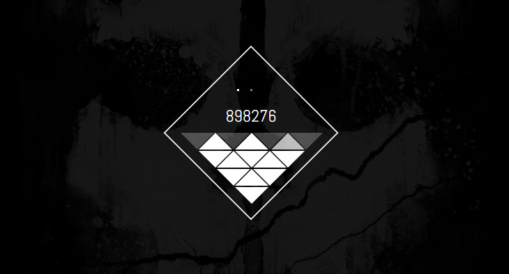
It does not always happen these days – but it would have been frustrating waiting for a website to load its content. If it is unavoidable for your website, try this: create some cool UI or animation to ‘entertain’ users while waiting for the loading to be done. 2NE has created a cool loading UI demo with a Call of Duty game concept. What are other impressive loading interfaces you have seen?
 Stampede Design