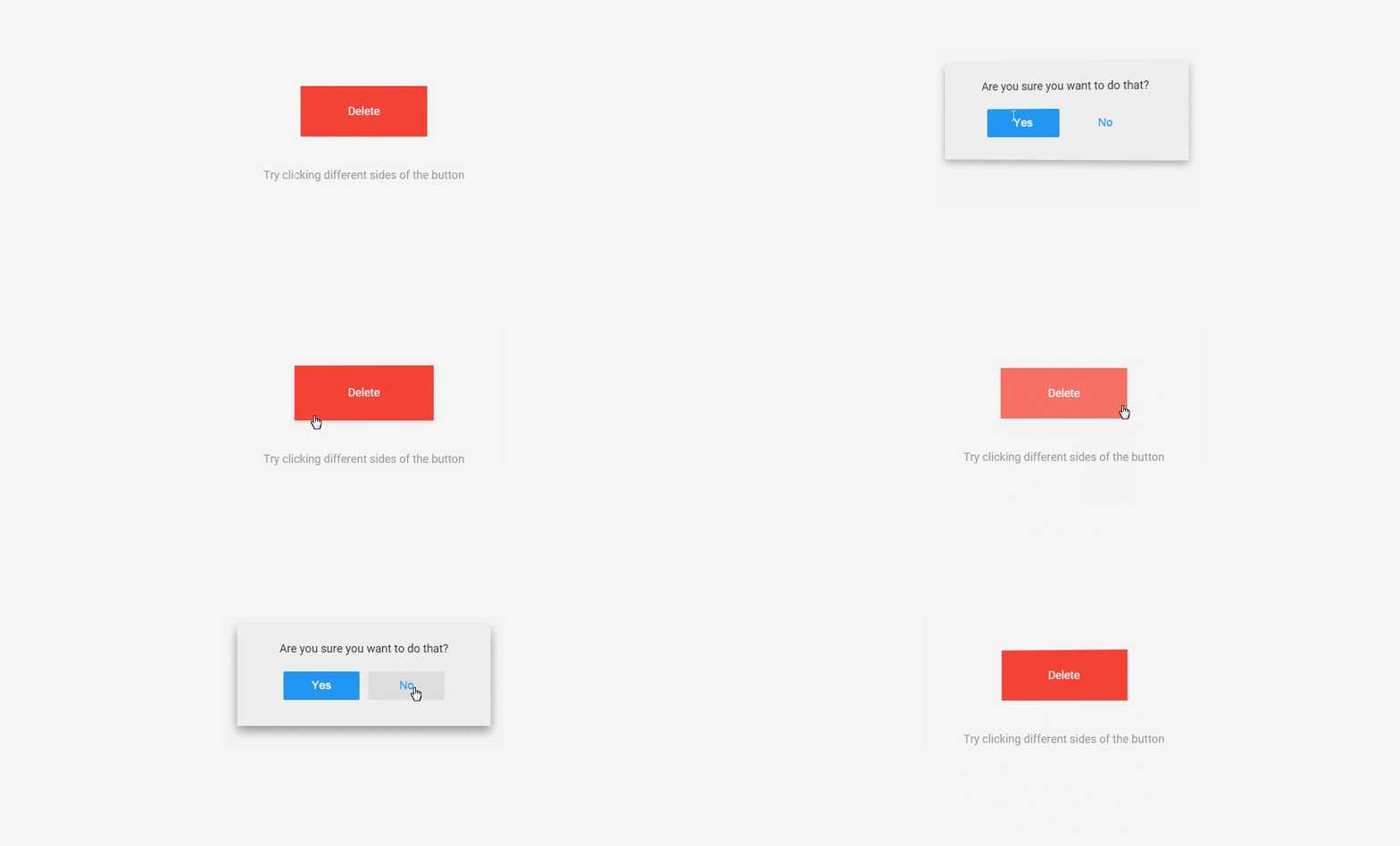
Flipside is a nice, little UI concept for buttons interaction created by Hakim El Hattab. The first cool part is the seamless integration of the confirmation prompt as soon as user clicks on the action button. The second cool part is the subtle details in the button flip transition. Take a look at the demo. Did you notice that the button flip direction depends on which side of the button you are clicking? For example, if you click on the left side, the left side of the button will be pushed back and the other side will appear from the right. The continuity of the effect can also be observed when closing the confirmation prompt where the previous flip effect is simply reversed to reveal the main button for a more natural feel. Hit the buttons below to try the demo and view the codes.
All posts filed under “User Interface”
All the User Interface-related tutorials, ideas and various posts in Stampede Constructs
Minimal Responsive Newsletter Form
Getting a user to subscribe to a website’s newsletter mailing list is always the most challenging part. IMO, the key is where you position the call-to-action form. Then there’s the UI and UX of the newsletter form itself. When user decides to subscribe, we need to make sure the process is flawlessly smooth and simple. Claudia Romano and her team started experimenting with some subtle CSS3 animations to enrich the newsletter form while the user is interacting with it. You can see how the process improves user experience greatly through fluid animation and minimal interface.
Accordion Menu With Sliding Tiles
In my previous posts, I have already shared 2 posts about a number of demos and tips on creating an accordion menu. This time, I would like to share a demo of a sliding tiles accordion menu, a brilliant experiment by Wifeo. The logic behind this demo is actually quite straightforward. The tiles each respond to mouse over and slide to the sides to reveal text corresponding to the active tile. Wifeo achieved this through CSS visibility property to show and hide the text and transition for sliding the tiles on hover. Try it out!
UI Idea: Icon Filling Effect
Icons are commonly used in user interface to communicate a message quickly and to support textual content. When done right, it serves more than eye candy and actually helps readers to maintain eye tracking as they scroll down a website. But what if we can produce icons with effects that transcend their usual static properties? Inspired by the cool icon filling effect of vertical timeline on Elliot Condon’s website, Sebastiano Guerriero from codyhouse showed us how to achieve the same effect with a little help from transparent icons. Though it requires some advanced CSS techniques, it’s worth to learn and is perfect for one-page website. Using this icon filling effect, you are now able to piqué readers’ interest and guide them from one section to the next. Well done, Sebastiano!
Loading UI Inspired by Call of Duty: Ghosts
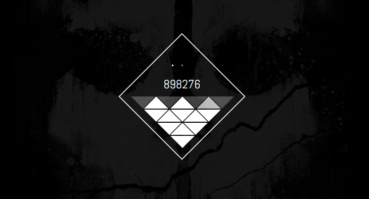
It does not always happen these days – but it would have been frustrating waiting for a website to load its content. If it is unavoidable for your website, try this: create some cool UI or animation to ‘entertain’ users while waiting for the loading to be done. 2NE has created a cool loading UI demo with a Call of Duty game concept. What are other impressive loading interfaces you have seen?
CSS Ratings Interface
Simplistic Form Interface
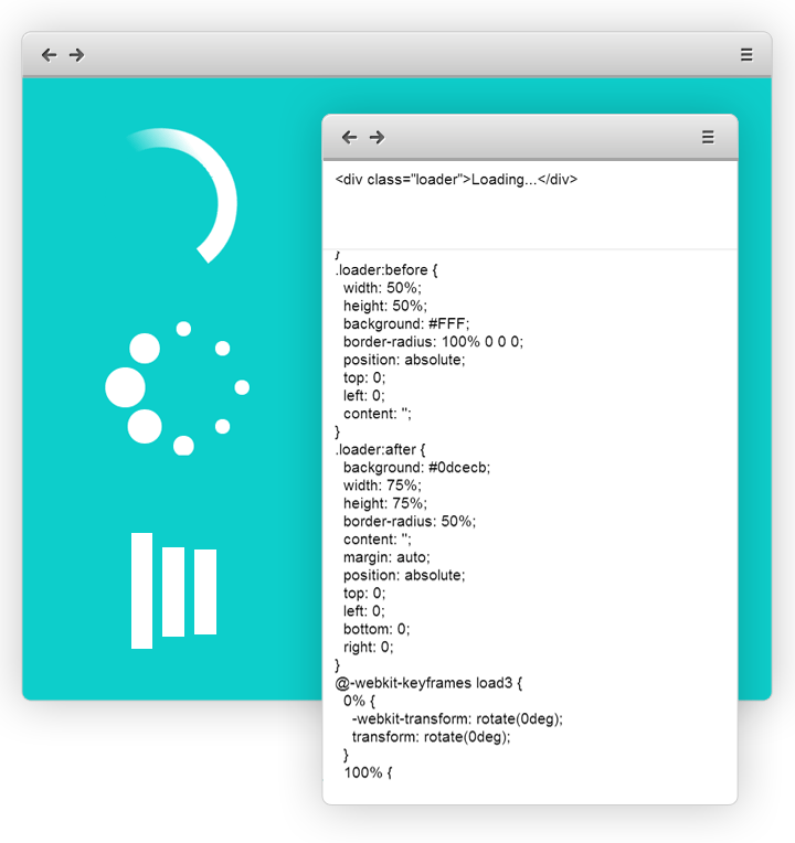
Lightweight CSS Spinners
Until recent years, programmers had to resort to using animated gif anytime a loading spinner is required. Thanks to CSS3, that is no longer the case. Luke Haas has shared a useful and most importantly lightweight method of using only CSS and a single HTML element to create spinners. Each spinner consists of a single div with a class of loader and content text of “Loading…”. The text is for screen readers and can be used as a fallback state for older browser.
 Stampede Design