One of the common CSS obstacles for novice web developers is trying to keep your website footer at the bottom of a page with short content. This unwanted behavior causes the footer to appear higher on pages with short content making the website looks half-complete. Matthew James Taylor wrote a nice little tutorial to those who are just starting out in HTML and CSS about how to keep footers at the bottom of the webpage permanently. In this tutorial you’ll learn a cross-browser solution to positioning the footer using position:absolute and a couple of height properties. Hit the buttons below to learn more.
All posts filed under “CSS”
All the CSS-related tutorials, ideas and various posts in Stampede Constructs
Centering Icon Font with Adjacent Text
When working with icon fonts, one of the issue you may encounter is when trying to vertically center the icon font against an adjacent text. If the text are all lowercase, the approach is pretty straightforward using CSS vertical-align:middle. However, when you have an all uppercase or a title case text, the icon starts to go out of alignment and possibly none of the usual vertical-align values can mitigate it. In this blog post, Jonathon Snook explains how he worked around this issue using some relative positioning and a manually set value using the ex unit on vertical-align. Hit the button to learn more.
CSS3 Selectors You Might Not Know About
A selector is the most basic component in CSS and CSS3 comes a bunch of selectors and pseudo classes that works wonderful with modern browsers. For instance, you can select the first letter of a paragraph to produce a drop-cap effect, select even and odd elements for making zebra stripe table rows, highlight a certain section when users click on a link with an anchor and many more. If you are fairly new to the world of CSS, check out this article by Chris Sevilleja to get acquainted with some of the commonly-used CSS3 selectors. For a more advanced coverage, check out this related article we have featured a while back. Hit the button below to learn more.
HTML vs Body in CSS
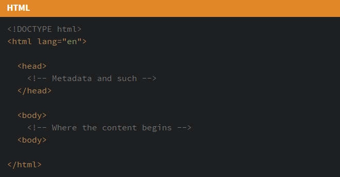
The difference between <html> and <body> is easy to overlook. When applying global styling to a webpage I tend stack up all the CSS rules to the <body> element without even thinking much. This is not incorrect but as a frontend developer it is a good idea to be aware of every lines of codes we wrote. In this CSS-Tricks article, Geoff Graham goes over the key differences between the use of <html> and <body> in CSS and consider some practical applications where styling one over the other might make sense. Hit the button to learn more.
Fixed Background Effect With background-attachment
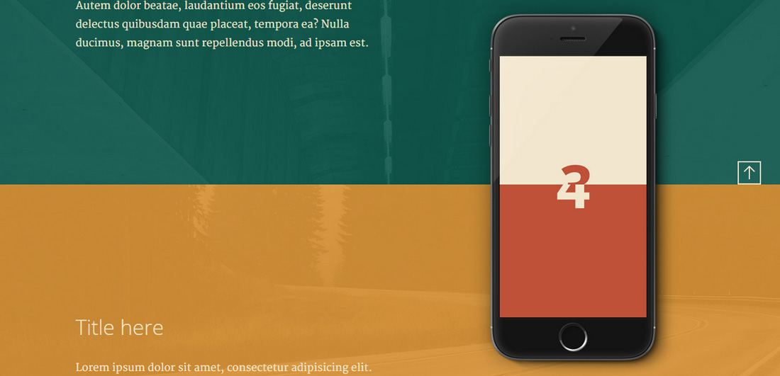
One of the simple but beautiful effects you can apply on a webpage especially landing pages is by having a fixed-position image placeholder that changes its image as user scrolls up and down the page. This can be done using just CSS as demonstrated by UI/UX designer Sebastiano Guerriero in his blog at Codyhouse.co. The single CSS rule to accomplish this is background-attachment:fixed; which prevents the image placeholders from scrolling together with the page. Finally in each placeholders you simply need to set the image relevant to the content for the particular section. Hit the buttons below to learn more or jump straight to the demo.
A Visual Guide to CSS3 Flexbox Properties
One of the new features of CSS3 is the Flexbox Layout, officially called CSS Flexible Box Layout Module which was designed for laying out more complex applications and webpages. Flex layout is superficially similar to block layout. It lacks many of the more complex text- or document-centric properties that can be used in block layout, such as floats and columns. In return it gains simple and powerful tools for distributing space and aligning content in ways that webapps and complex web pages often need. The contents of a flex container:
- can be laid out in any flow direction (leftwards, rightwards, downwards, or even upwards!)
- can have their display order reversed or rearranged at the style layer (i.e., visual order can be independent of source and speech order)
- can be laid out linearly along a single (main) axis or wrapped into multiple lines along a secondary (cross) axis
- can “flex” their sizes to respond to the available space
- can be aligned with respect to their container or each other
- can be dynamically collapsed or uncollapsed along the main axis while preserving the container’s cross size
For a more visual guide to the CSS3 Flexbox properties, check out this Scotch.io article by Dimitar Stojanov with the accompanying demo.
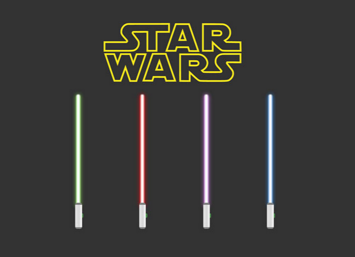
Pure CSS3 Star Wars Lightsaber Checkboxes
Are you a Star Wars fan? Then you should check this out. Nicholas Cerminara of scotch.io has created a pure CSS3 Star Wars lightsaber built around the HTML checkbox element that you can toggle on and off. He utilizes the checkbox hack :checked ~ div to construct the lightsaber. Nicholas admitted that he created this just for fun and less for UI/UX but boy it sure looks very cool. His demo features four different lightsabers: Yoda’s, Darth Vader’s, Obi-Wan’s, and Mace Windu’s. Hit the buttons below to view more.
How to Create a Chrome Extension in 10 Minutes Flat
In this Sitepoint article, web developer John Sonmez showed us how easy it is to create a Chrome extension in just 10 minutes. Chrome extensions consist of HTML, CSS and JavaScript. Like regular websites, the UI are build using HTML and CSS while the extension logic are handled via JS that taps into the Google Chrome JS API. Finally to plug these files as a Chrome extension, you need a manifest file called manifest.json that describes your plugin in the way that Google Chrome understands. Take a couple of minutes to follow John’s tutorial and you’ll end up with a basic website speed analyzer extension that provides a really nice base for further customizations and tinkering. Hit the button below to learn more.
Creative Gooey Effects
In this Codrops post, web developer Lucas Bebber demonstrated an advanced experimental gooey effect using SVG filters that can be used on a variety of web interactions. With SVG Filters we can modify a given source graphic with special effects and use the result as an input to another filter declaration, creating an infinite range of possibilities for effects. Read more to understand how the whole effect is constructed and check out the demos to get some ideas on how the gooey effect can be applied elegantly in real world applications.
Animating Hamburger Menu Icons with CSS
Hamburger menus have become the staple menu style in responsive websites and web apps. The presence of a hamburger menu is usually indicated using a recognizable UI button with a three-bar icon on the top corner of the screen. With the coming of age of CSS animation, front-end developers can get creative by applying cool animations on the button as it transition between open and close states. The key requirement for doing this is to avoid using a static image as the button icon, instead the three-bars are added using CSS pseudo-elements so that they can be manipulated using CSS. Web developer Nick Salloum has written an easy to follow tutorial on animating hamburger menu icons using only CSS along with four cool animation ideas in his demo. Hit the buttons below to learn more or view the demo.
 Stampede Design
