All posts filed under “CSS

All the CSS-related tutorials, ideas and various posts in Stampede Constructs

comment 0

An Introduction to the CSS will-change Property

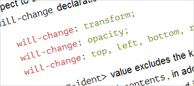
Today many front-end developers are leveraging CSS3 transitions, transforms, and animations to add a new layer of application interactivity that was previously left up to JavaScript libraries or Flash. If you have been doing this long enough, you’ll be aware that the smoothest and most beautiful animations are hardware-accelerated. A fairly new CSS property called will-change will allow you to optimize your animation executions ahead of time by letting the browser and hardware perform potentially-expensive work preparing for an animation before the animation actually begins. As simple as it may sounds, implementing will-change into your code is not straightforward though. This Sitepoint article by Nick Salloum attempts to explain what it is, when and how to use it, and how not to use it. Click the button to read more.

View More

Filed under: CSS


CSS SANS
comment 0

CSS SANS – Build Fonts Using CSS

CSS SANS is a set of letters from A to Z build using CSS or in other words a font created by CSS3. It is a joint work by Yusuke Sugomori and Masanari Kakamu to give us a glance on the unprecedented history and evolution of web technologies such as CSS and web browsers. When viewed on traditional browsers such as IE5 or IE8 that only supports CSS1 and CSS2 respectively, one can see the imperfection of the rendered letters especially on the CSS1 browsers. Although it is not something you can use on a production website, CSS SANS certainly shows us how far the web has come in the last two decades.

View More   View Demo

Filed under: CSS


comment 0

Media Queries: width vs device-width

If you are new to the world of responsive website development, you have probably seen at least the most basic media query expression using width. Besides width, there is also device-width which expands to min-device-width and max-device-width. Although it’s unlikely that you are going to use device-width, it is important to have a good understanding about the difference between width vs device-width. For a rough idea, take a look at the main image used in this blog post above. For a more detailed and technical explanation, check out this Sitepoint article by web developer Ryan Reese as he attempts to shed some light on this topic accompanied by simple code demos. Hit the button to learn more.

View More

Flickity - a Plugin to Flick The Slider
comment 0

Flickity – A Responsive Flick-able Slider

Flickity JS is a responsive, touch-enabled carousel plugin with a huge options list and a flexible API. Beside working like a normal carousel with pagination and left/right navigator, it allows user to flick the slider to navigate between the slides. It can be run as a jQuery plugin or on its own. Below is the basic HTML structure for a Flickity gallery:

<div class="gallery js-flickity">
	<div class="gallery-cell"></div>
	<div class="gallery-cell"></div>
</div>

You can also read David DeSandro, Flickity developer post on CSS-Tricks to learn more about Flickity. Note that Flickity has three kinds of licenses which are open-source, commercial, and OEM. Hit the button below to learn more and view some of the demos.

View More

comment 0

Media Queries: A Look at Different Media Features

Media queries are the building blocks of responsive websites. They work by allowing front-end developers to style a website based on conditions such as screen size, orientation and resolution. In this Sitepoint article, web developer Ty Strong shares a wide range of media query features and ways to construct media query with multiple conditions. This article is a great read for anyone just starting out with responsive web development as well as the pros who may not be aware of some of the media features that exist today.

View More

Filed under: CSS


comment 0

Understanding CSS Grid Systems from the Ground Up

CSS grid systems have grown a lot in popularity, quickly becoming the foundation for building any websites and considered as best practice for rapid layout scaffolding. A good grid system allows front end developers to manage website structure more consistently and is key when working with responsive websites. Anyway, if you have ever wondered what makes up a grid system and their mechanism, please check out this Sitepoint article by web developer Ryan Morr. This extra knowledge could be beneficial when you have to decide between a number of grid system to use for your future web project. Hit the button to the learn.

View More

Filed under: CSS


css3
comment 0

When to Use CSS !important Declaration?

The CSS !important declaration is used to give priority to certain styling rules or overwrite unwanted styling in a website. It is also commonly used during debugging such as in Inspect Element. But is it really OK to use !important? This question was philosophized in a blog post by web developer cum philosopher Jens Oliver Meiert. My take on this is to use !important when you know what you are doing as it can cause problems for future styling. So, don’t ever use it until you really need it and consider this as a last resort.

View More

Filed under: CSS


comment 0

HTML and CSS Cheat Sheet (Infographic)

Calling all beginners who wanted to be a website developer or designers looking to dabble in HTML and CSS, web hosting company Bluehost has just the infographic for you. According to Bluehost, even with interactive drag-and-drop web-building tools such as WordPress and Weebly, it is still important to know some basic coding when building websites. They are right! If you haven’t used HTML and CSS before, or if you consider yourself a beginner, take some time to familiarize yourself with these basic coding languages using this cheat sheet.

View More

comment 0

5 Common Responsive Website Challenges and Solutions

Now that we are in 2015, mobile-friendly or responsive websites has certainly become a standard requirement for any new web design project. In this blog post at Cats Who Code, web developer Jean shares five super useful front-end coding techniques to tackle common responsive website challenges namely responsive images, responsive HTML videos, responsive YouTube videos, responsive navigation menu and responsive tables. Hit the button below to learn more.

View More

Filed under: CSS


css3
comment 0

Accidentally Overriding CSS Properties

I bet this is a common problem to novice CSS coders, when you accidentally override CSS properties by using shorthand properties. When I just started doing CSS, I stumbled upon this problem that I thought was a “bug” with many different CSS properties like padding, font and especially background. Here is a simple code example to show how this can happen:

	.container {
		padding-top:25px;
		padding-bottom:40px;
		padding:25px;  /* this shorthand CSS property will override all padding properties above and set all padding directions to 25px */
	}

To prevent this from happening, you can use shorthand the CSS property first, followed by any specific CSS properties you want. For example:

	.container {
		padding:25px; 
		padding-bottom:40px;
	}

Hit the button below to see more examples at CSS Tricks.

View More

Filed under: CSS