 Stampede Design
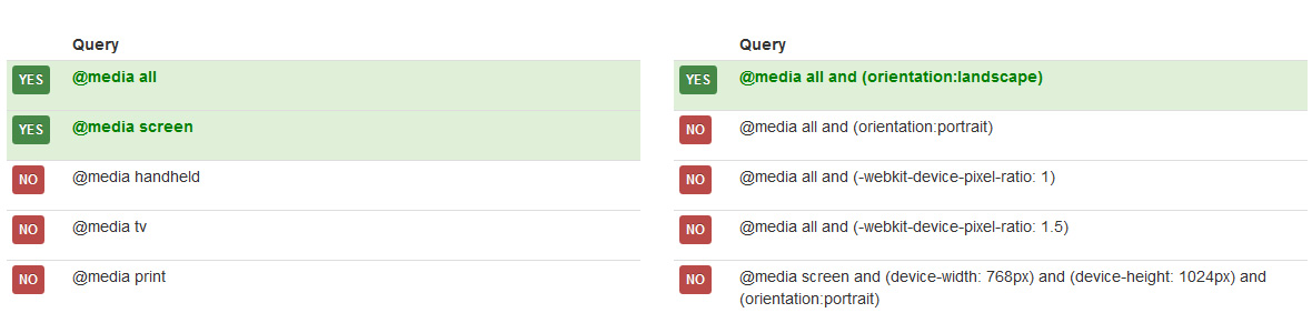
One thing about CSS Media queries is that it allows you to target CSS rules based on – for instance – screen size, device-orientation or display-density. This means you can use CSS Media Queries to tweak a CSS for an iPad, printer or create a responsive site.
Learn to create a responsive website using CSS Media Queries with a number of tutorials provided by Netherlands-based developer Niels van Hove.