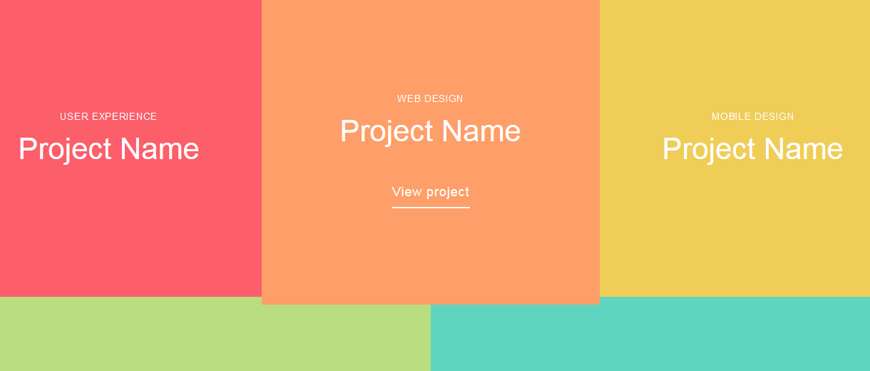
It’s a good user experience practice to hide secondary content until your user needs it. One of the ways to do that is by using tiles with expanding content overlay on hover. Kickdrop has featured a tutorial to achieve this. Check it out and let us know what you think.
All posts tagged “css”
All the CSS-related tutorials, ideas and various posts in Stampede Constructs
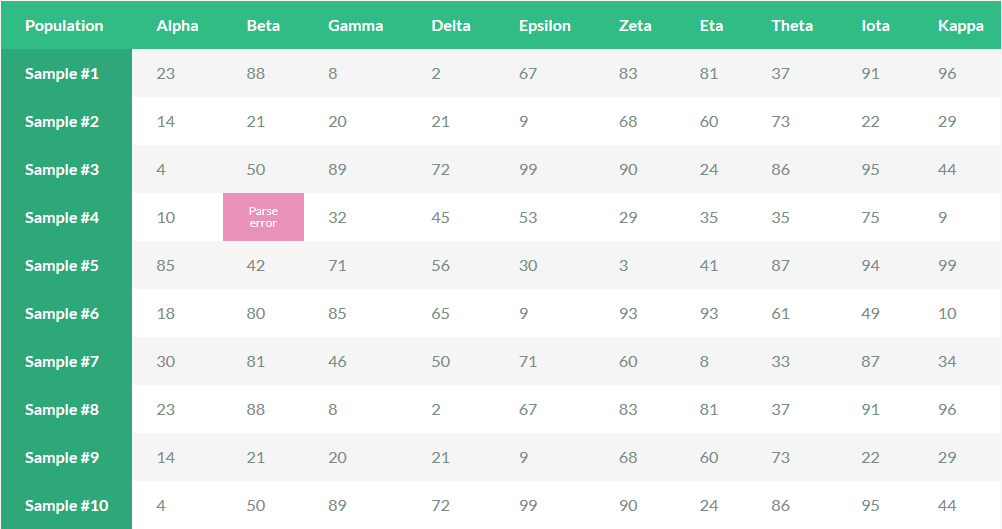
Sticky Website Table Headers and Columns
CSS3 Animations Showcase
If you have been active in the web design and development industry, you must have likely heard of Lea Verou. Having a long-standing passion for open web standards, Lea has been published a number of useful tutorials and showcases online for the benefit of everyone.
Here is one of it – a showcase of a CSS3 animations as compiled by her.
CSS Gradients through background-blend-mode
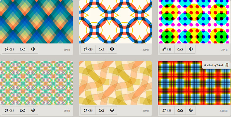
The CSS background-blend-mode property blends the backgrounds of an element: colours, images, and gradients, together with Photoshop-like blend modes (multiply, screen, overlay, etc). It is very new and is currently supported by the latest releases of Chrome, Firefox, and Opera. The property is coming to Safari soon but is not available in Internet Explorer. Bennett Feely has shared several CSS gradients backgrounds made possible via background-blend-mode. Check it out.
CSS Selectors and Their Functionalities
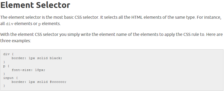
This huge list of articles written by Jakon Jenkov will clarify CSS selectors and their functionalities. While you are at it, be sure to check out his other explanations and tips for the rest of the CSS functions. A mighty good read for those who often work with CSS as well as new developers.
Simple Parallax Scrolling
Parallax scrolling which was created by Ian Coyle for “Nike Better World” website in 2011, is what everyone has been talking about these days. It is a special scrolling technique with stunning effect often used as a great tool to serve user experience and perfect for storytelling websites. Petr Tichy has shared simple parallax scrolling tutorial at ihatetomatoes.net. Check it out.
Pure CSS Taj Mahal
Just when you thought you are done to be awed by the powers of CSS, this Taj Mahal made of pure CSS by Jan Dennison is just set to jaw-droppingly amaze you more. Be sure to give it a try yourself.
Simplistic Form Interface
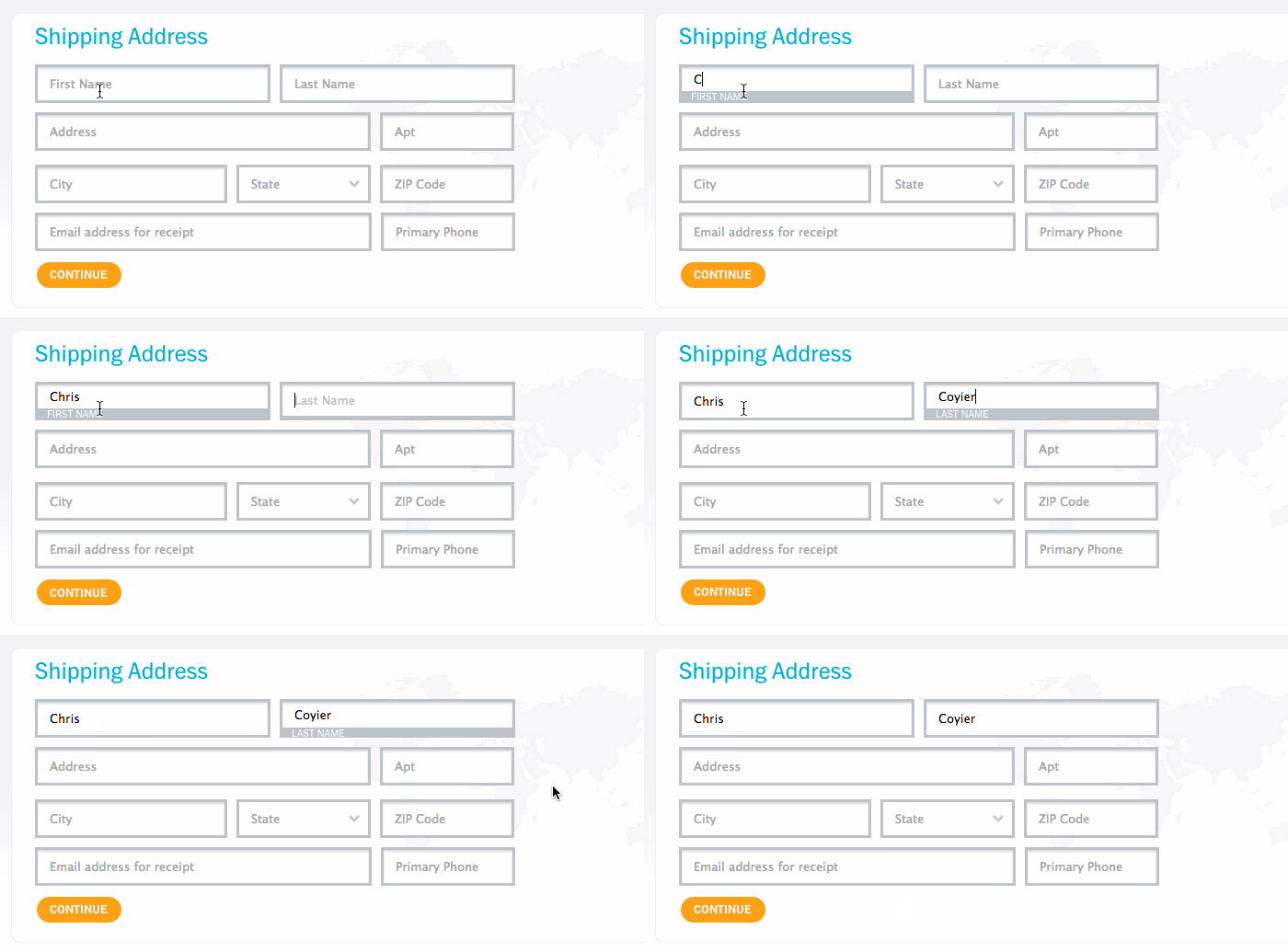
Better Form UX through Label Floating
This highly useful technique helps user to remain informed when filling a form while taking less screen space, especially on mobile (read Brad Frost’s article discussing the pros and cons). From a design perspective, it is cleaner and space-efficient compared to having labels separate from their inputs. Thanks to Chris Coyier, a better form UX through label floating can now be done in pure CSS.
Cool CSS Shadows
Change lighting source by moving your cursor around. This cool CSS shadows in unique javascript was done by Benjamin Bojko and Naim Sheriff from Big Spaceship. You can play around with dynamic light position, customize your shadows and use text or boxShadow based on content. This javascript has no library dependencies and is compatible with AMD. It also works in browsers that support textShadow or boxShadow and auto-prefixes if necessary.
 Stampede Design