At scotch.io, Chris Sevilleja loves to talk about Foundation 5 framework by ZURB. Foundation 5 is a great front-end framework that is a solid alternative to Bootstrap. It does have a few features that Bootstrap doesn’t, hence it deserves a look at the features before being dismissed. In this post, Chris outlined a cheatsheet about the difference of Bootstrap vs Foundation in terms of CSS elements, class names and also grid names. Enjoy!
All posts tagged “css”
All the CSS-related tutorials, ideas and various posts in Stampede Constructs
CSS: Search Form Styling Experiment
In her search form demo, Paula Borowska will be showing four different takes on how you can spruce up a search input with the help of CSS transitions. Nothing too crazy – there are about four different search box styles – styled with background fade, expand input on hover, increasing icon size on hover and button will appear on hover. Find out more by hitting on the buttons, please!
CSS Glitch Effect
Chris Coyier showed us the mechanics behind Lucas Bebber’s stunning CSS effect called Glitch. Chris created three copies of the desired area via pseudo elements and these copies are positioned right on top of each other and they can be controlled individually. View more to see his complete guide to create the CSS glitch effect. Also check out Chris’s own version of the effect at the end of the article.
Complete Guide to Center Things in CSS
There are many ways to center things in CSS and it depends on the situations and creativity of the front-end developer, which can sometimes be quite confusing. Thanks to Chris Coyier, he has created a complete guide for centering things in CSS. Also covered in the article is how to CSS center things in different situations for vertical and horizontal modes respectively, and also for both modes at the same time. Very useful.
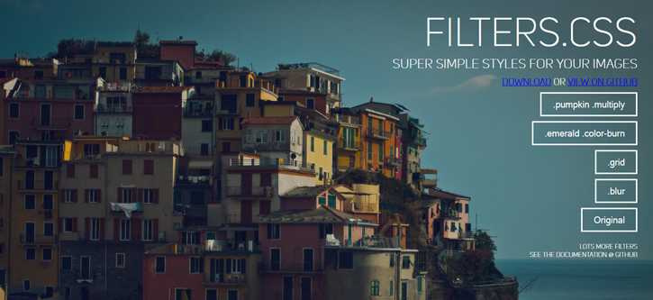
CSS Image Filter with FILTER.CSS
Filter.css is used to apply image filters, patterns and colour blending, especially useful for making full image background appear better. To apply the CSS image filter effects, you’ll simply need to add class name. For example, class="grid" applies a grid filter to the desired area in an HTML file. David Furlong has prepared five examples in the demo page showing blurred and overlay filters among all. You can also combine several filter classes for more design control. Visit the link for a list of applicable class names and demo.
Skrollr.js Scrolling Slideshow Website
Another useful tutorial by professional front end developer, Petr Tichy. By using skrollr.js, Petr Tichy has created a scrolling slideshow website containing 4 fullscreen sections with images and a short description. In his blog he has also included a video tutorial for step-by-step details. Enjoy!
Pure CSS Fruits
Heads up – this is one of the top ten Codepen demos picked by scotch for the second series of top 10 Codepens of the week. This demo, as self-explanatory as its name, is about how to create fruits by using 100% pure CSS. The most important element to create this fruit is by using CSS pseudo code which are :before and :after. Created by Lars Munklolm, you may check out the demo by clicking on the button below.
Minimal Responsive Newsletter Form
Getting a user to subscribe to a website’s newsletter mailing list is always the most challenging part. IMO, the key is where you position the call-to-action form. Then there’s the UI and UX of the newsletter form itself. When user decides to subscribe, we need to make sure the process is flawlessly smooth and simple. Claudia Romano and her team started experimenting with some subtle CSS3 animations to enrich the newsletter form while the user is interacting with it. You can see how the process improves user experience greatly through fluid animation and minimal interface.
Dealing with a large CSS codebase
CSS is sometimes described as a simple and easy language. It can quickly become very complex and working with it can be a pain if there is no structure. As projects evolve, so does CSS. This can be easily avoided if there are some structures and guidelines around the code.
Try to keep the file structure clean and simple to prevent you from having problems with finding files and reassessing your structure. Besides, writing comment is extremely important to describe components, how they work, their limitations and the way they are constructed. Don’t let other team wasting time guessing what the purpose of the code is.
In his blog, Jake Bresnehan has shared 14 tips to deal with a large CSS codebase. Besides commenting and keeping things simple, find out about the other tips by clicking on the button below.
Sass 3.4 is Released!
After a couple of months Sass 3.3 had been released, the new update is now available with version 3.4 under the code name “Selective Steve”. Most new features in this version are about selectors. There are 8 new functions you can play with Sass 3.4 selectors. Beside selectors, Sass 3.4 also comes with @error directive and this feature now could make Sass handles errors in a cleaner way. Isn’t that exciting? To discover more in this release of Sass 3.4, read the article by a Sass big fan, Hugo Giraudel by clicking on the button below.
 Stampede Design


