The most common use case when working with responsive images is you need different resolutions of the same image for different screen sizes. For this particular straightforward use case, Chris Coyier recommends using srcset on the <img> tag to control which image gets loaded in different widths rather than using the more verbose and complicated <picture> tag with explicit <source> declarations. Click the button to read the full discussion.
All posts filed under “HTML”
All the HTML-related tutorials, ideas and various posts in Stampede Constructs
Tab Styles Inspiration
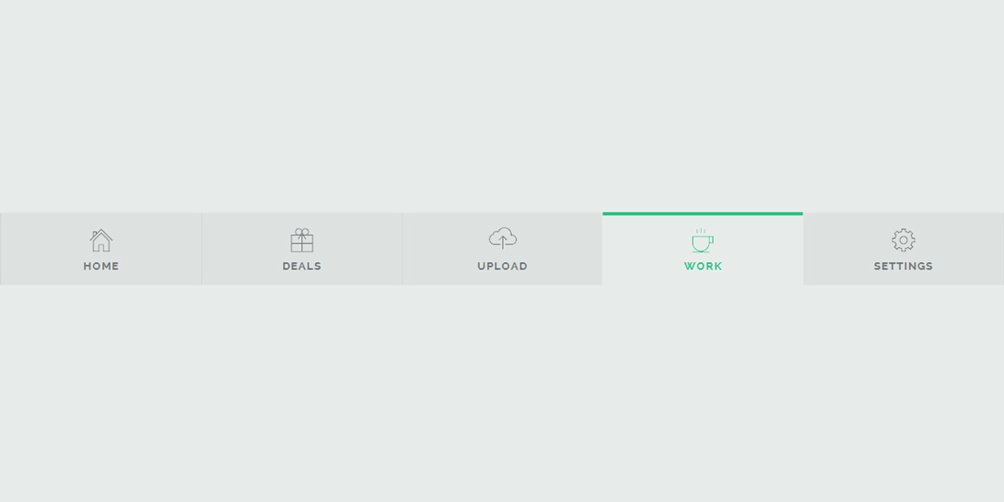
Mary Lou from Codrops shared a couple of subtle modern tab styles and effects. The collection contains some styles and effects for modern tabs; from a simple box to a SVG shape. Depending on your design, different tab layouts and looks can spice up your sections; think outside of the box (literally) and you’ll see how interesting the usually boring tabs can become. Inspired? Check out the demo page provided.
CSS Creatures
You can now create your own CSS creatures by tweeting them to @csscreatures. These adorable CSS cuteness are generated 100% from HTML5 and CSS3 and created by Bennett Feely. You can customize your own monster by tweaking body colors, personalities and more. I’ve created my very own monster in turquoise with huge buckteeth and a happy (with just a tad bit crazy) LOL – mine is the one on the most left! Create one and share yours!
Accordion Menu With Sliding Tiles
In my previous posts, I have already shared 2 posts about a number of demos and tips on creating an accordion menu. This time, I would like to share a demo of a sliding tiles accordion menu, a brilliant experiment by Wifeo. The logic behind this demo is actually quite straightforward. The tiles each respond to mouse over and slide to the sides to reveal text corresponding to the active tile. Wifeo achieved this through CSS visibility property to show and hide the text and transition for sliding the tiles on hover. Try it out!
Side Hamburger Menu With Animation
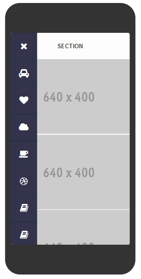
Nice demo by Gianmarco about creating animated side hamburger menu with a number of categories to choose from. Users can click on the hamburger icon for the menu appear and click “x” button to close the menu. However, this feature currently fully works in Chrome only, while it may seem lagged for the other browsers.
Tips To Fix CSS Layout Issue
Pulling your hair dealing with CSS layout issue?
Here are some tips to fix common issues with CSS layout
View Source

Try to view source (CTRL+U on FF) on your browser. This is the best tools to check if all tags are properly close or if you have duplicate IDs on one same page. Most of the times, this is the culprit.
Inspect Elements

Another great tool. Try delete your suspected element that caused layout issue using inspect element. This way, you can focus to fix only that element.
Clearfix
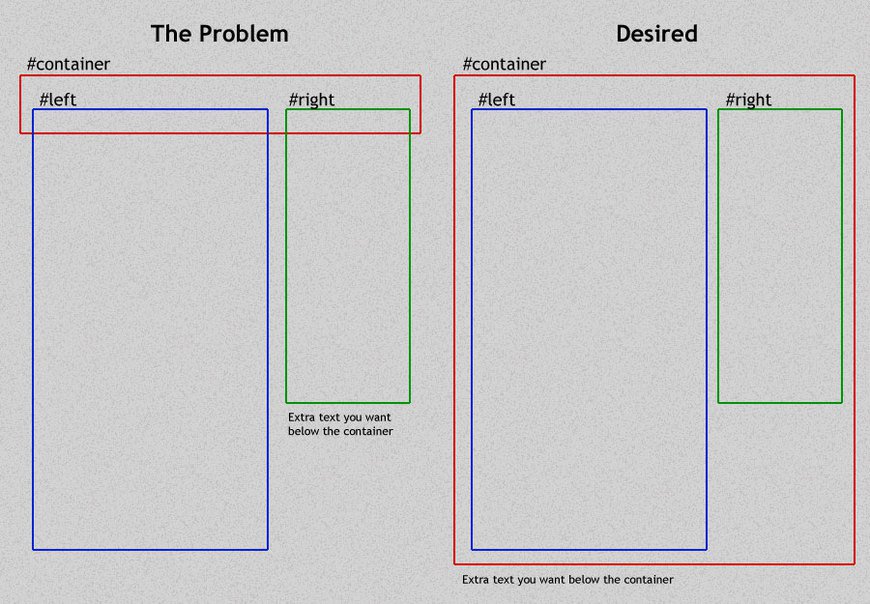
Clear your floating container using clearfix. When you have floating elements, don’t forget to add clearfix for the container. View full explanation about floats and clearfix by Chris Coyier.
/* A clearfix is performed as follows: */
.clearfix:after {
   content: " "; /* Older browser do not support empty content */
   visibility: hidden;
   display: block;
   height: 0;
   clear: both;
}

/* Or, if you don't require IE<8 support, the following is fine too: */
.clearfix:after {
  content: "";
  display: table;
  clear: both;
}

/* HTML with clearfix */
<div style="float: left;" class="clearfix">Sidebar</div>
<!-- No Clearing div! -->
Do you have other tips on fixing CSS layout issue? Comments are welcome!
Loading UI Inspired by Call of Duty: Ghosts
It does not always happen these days – but it would have been frustrating waiting for a website to load its content. If it is unavoidable for your website, try this: create some cool UI or animation to ‘entertain’ users while waiting for the loading to be done. 2NE has created a cool loading UI demo with a Call of Duty game concept. What are other impressive loading interfaces you have seen?
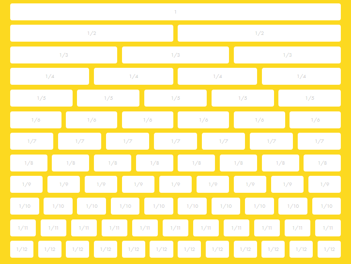
Lemonade Responsive Framework
5 Things Front-End Developer Should Learn in 2014
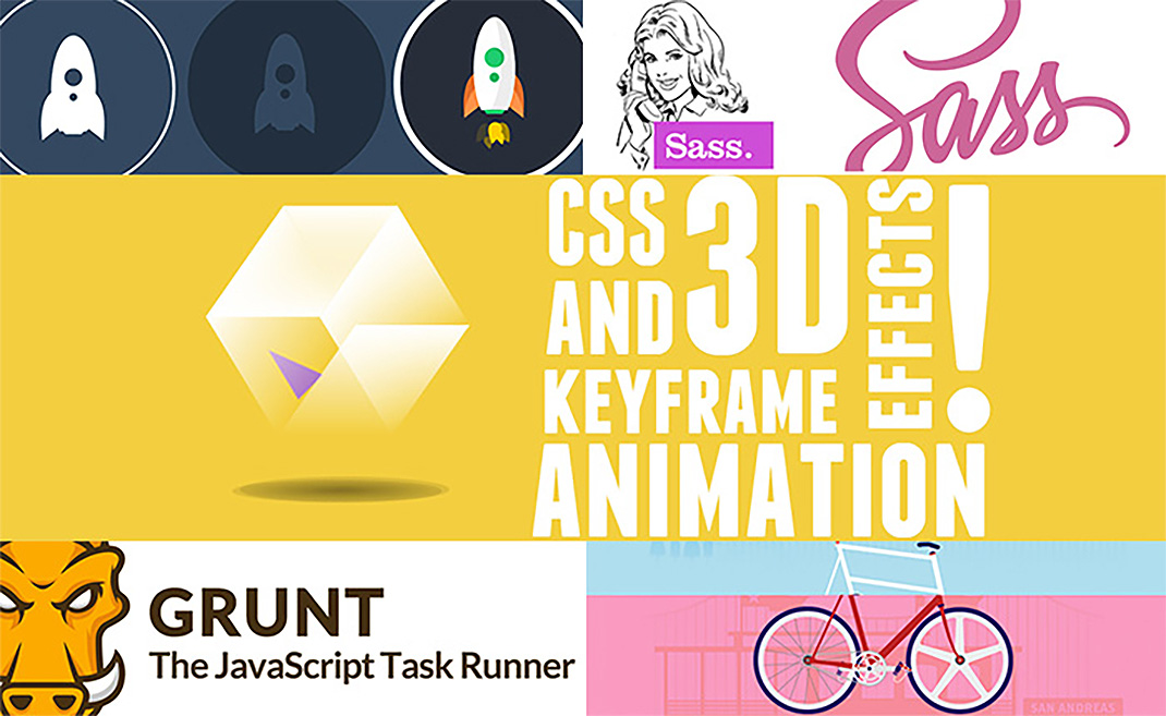
The web industry operates at a breakneck speed and so all front-end developers must continue to learn and keep up to date with the latest trends, methodologies, languages and techniques. In this compact yet excellent article by Joe Howard, you will find 5 useful skills you could master this year that will help you remain at the forefront of the latest web development know-how. Think SASS, Grunt, SVG, CSS animation and custom parallax.
Swing Text Effect
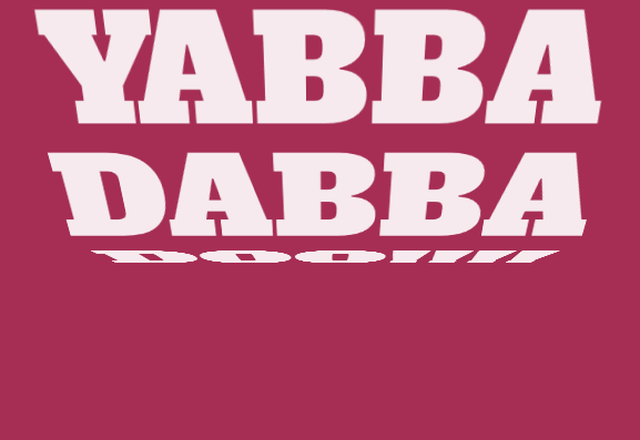
Mladen Stanojevic did this bold and cool swing text effect using a combination of HTML, CSS and JavaScript. You could change the swing direction, animation speed and other properties. This will look great on a landing page, so give it a try.
 Stampede Design