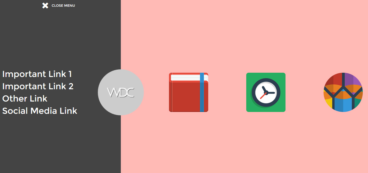
Getting bored with the usual sliding hamburger menu? Give it a little facelift by applying a closing door menu effect. Instead of having half of the page covered by the expanded menu, the new menu style has two panels sliding in from opposite ends of the screen covering the whole screen. You can take advantage of the extra space by adding interesting elements such as a company logo, featured product icons or a bigger menu. The effect is achieved using CSS3 transition with a little help by jQuery to control the z-index of the panels.
All posts filed under “CSS”
All the CSS-related tutorials, ideas and various posts in Stampede Constructs
Alternative Ways to Change CSS Background Image Opacity
Setting opacity on elements via CSS can be done quite easily but trying to do the same on CSS backgrounds without making the whole element transparent is quite impossible. However like all CSS workarounds, you just have to think creatively a little bit. In this article, Nicholas Cerminara of Scotch.io shared two different workarounds to set the opacity on CSS background images. The first is by using an image with “absolute” positioning to make it look like a CSS background. The other method is by controlling the background image using the :before or :after pseudo-elements.
16 CSS3 Selectors You Should Know
Understanding the concept of CSS selectors is a fundamental skill for doing any kinds of technical web works no matter you’re in design or code. In this blog post, Syed Fazle Rahman explained 16 important CSS3 selectors along with clear examples in an easy to understand writing. This article is a must-read for every novice front-end developers!
Tab Styles Inspiration
Mary Lou from Codrops shared a couple of subtle modern tab styles and effects. The collection contains some styles and effects for modern tabs; from a simple box to a SVG shape. Depending on your design, different tab layouts and looks can spice up your sections; think outside of the box (literally) and you’ll see how interesting the usually boring tabs can become. Inspired? Check out the demo page provided.
Simple Radial Menu
Somewhat similar to last week’s post titled Aperture Style Menu, Codepen user Nikolay Talanov created this cool, experimental “hamburger” menu where the menu items expand outwards and form a circle around the hamburger icon. To position the menu items at their specific places, he uses CSS transform attribute on pseudo class :nth-child(). For example, he uses .menu.active .rotater:nth-child(8) .btn-icon to position the Github icon. To view the full code of the Simple Radial Menu, hit the button below.
Pure CSS Drawings of Cartoon Characters
Front-end developers’ creativity in “drawing” using CSS never cease to amaze me. This is not limited to static illustration only but also includes animated CSS drawings. Check out the link below to view a collection of cool CSS drawings of cartoon characters by cssdesignawards. Love the pixelated Son Goku!
Aperture Style Menu
The colloquially named hamburger menu is a very common UI element in mobile websites and apps today, sliding in from left to right, top to bottom or vice-versa. In this Codepen post, user timbarden experimented with our beloved menu by placing the trigger right in the middle of the screen to produce a squarish aperture style opening and closing effect. Interested to see how this can be used in the real world.
Pure CSS 3D Cube Animation
This pure CSS 3D cube animation demo by Wifeo is especially awesome because it has a 3D shadow effect beneath the rotating cube. He created the solid shadow by styling the psuedo element i:after using background and then made it blur on the sides by using box-shadow. Finally, the cube shadow is positioned at the bottom of the cube by using transform. Go ahead and check out the cool demo.
CSS Animation Effect Libraries
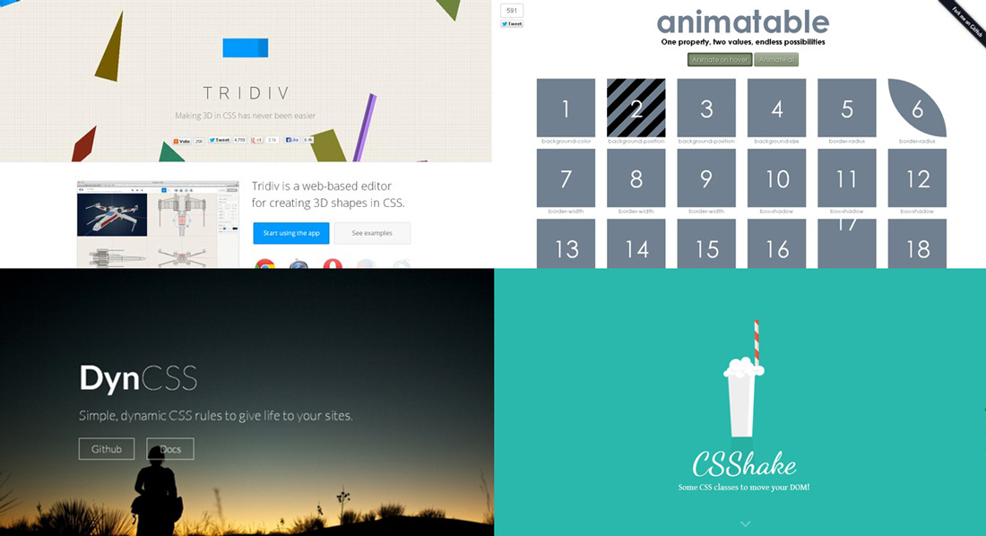
Clever use of animation on websites can certainly make them look more attractive and eye-catching to end users. However, poorly coded animations can easily hog down system resources especially on mobile devices causing the page to feel laggy. Codegeekz author Gavin has compiled a list of 18 CSS animation effect libraries that should help you get started with animating your websites or simply for poking around.
Steps to Draw With CSS
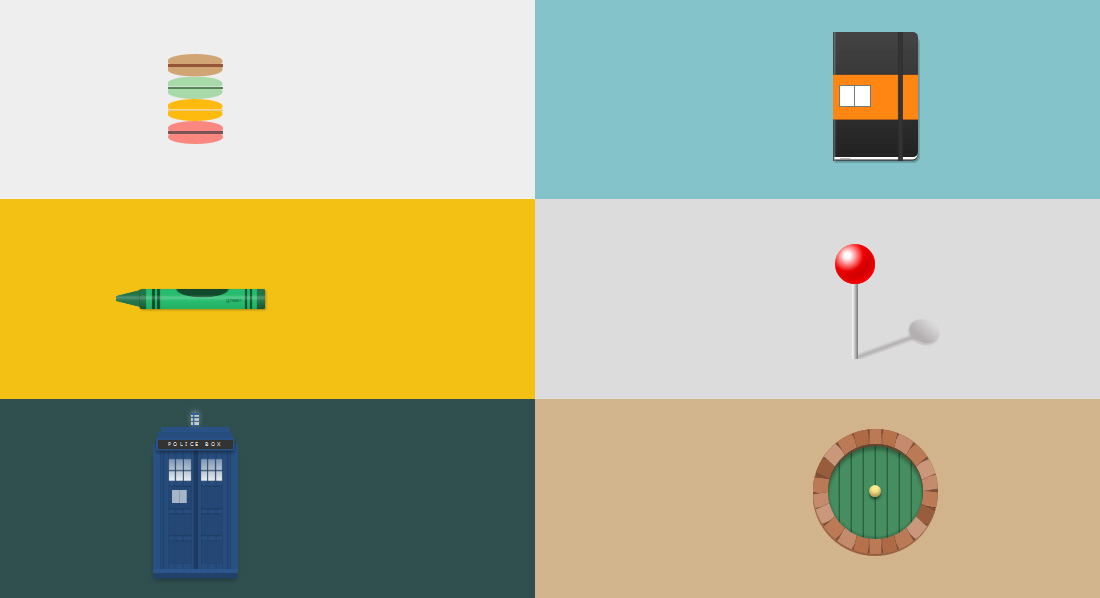
With the latest advancements in CSS, creating images or icons is no longer a rare thing. By using only one div, you can pretty much “draw” purely in CSS. In this article by Lynn Fisher and Robert Nyman, the authors walk through the basic steps to draw with CSS. As mentioned in this related post, CSS pseudo classes are the basis of this technique in addition to using various borders, background colors or gradients and shadow combination to produce generic shapes. Hit the button to learn more.
 Stampede Design


