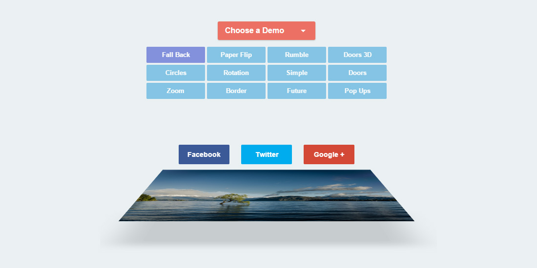
Danny Markov from tutorialzine.com has shared 12 types of sharing button effect demos. These effects were coded mostly in CSS with the transition, transform and filter CSS properties. Only the “Rumble” effect demo was built using a little jQuery plugin called jRumble. If you need a playful-looking effect, this plugin is a must. My personal choice? I love the fall back and the zoom effect. Hit button below to view more or to view demo.
All posts filed under “CSS”
All the CSS-related tutorials, ideas and various posts in Stampede Constructs
Mega-Menu Navigation
CodyHouse.co co-founder Sebastiano Guerriero shared a responsive and easy to customize mega-menu for large sites, enriched by subtle CSS animations and support for devices with JavaScript disabled. The unique thing about this mega-menu is the sub-items are revealed by slide-in approach instead of becoming an accordion in the mobile version. The slide-in style can also be found in the desktop version. This enables pretty much endless nesting of sub-items in the menu. Sebastiano created the mega-menu using a combination of HTML, SASS and jQuery. The HTML structure are broken into four main sections; <header>, <main>, <nav> and <div>. He kept the containers separate because they are much easier to handle in mobile devices. In bigger screens, the containers are all moved inside <header> using jQuery. View the full structure and style by hitting the button below.
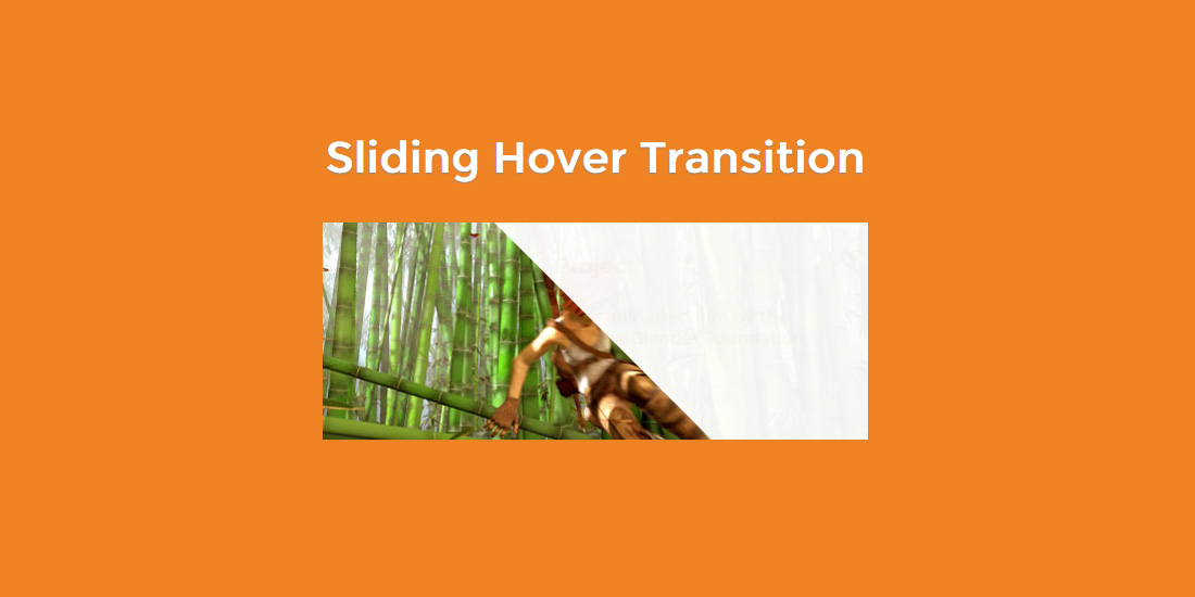
Diagonal Sliding Hover Transition
Fancy a cool-looking image hover transition using only CSS3? Check out this demo by webdesigncrowd.com. When hovering on the demo image, a diagonal shape layer will smoothly slide-in from the edge to reveal extra information about the image. This pretty simple and creative trick was created using two different shape overlays and merged into one shape. The original shapes are triangle and rectangle. I think the effect is cool but the amount of HTML needed is kinda bulky. Hit the button below to see the full code and demo.
Wobbly Slideshow Effect
“Wobbly Slideshow Effect” is an experimental slideshow effect shared by Mary Lou from Codrops. The slides wobble elastically as they transition to left or right giving the slideshow a cartoon-ish and playful feel. The wobble slideshow is inspired by a concept on Dribble called GIF Exercise by Sergey Valiukh. The trick with the wobbly effect is by animating the slide background SVG using Snap.svg to simulate the elastic effect. The default rectangle SVG path is morphed into right or left curved shapes according to which direction the slide is moving to next.
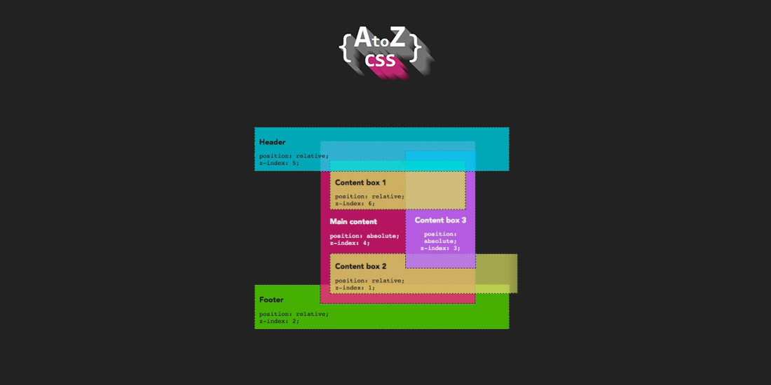
AtoZ: Z-index
One of the common challenges front-end developers face when working with web designs is having to stack or layer HTML elements on top of each other. With the z-index CSS properties, we can change the order elements get stacked. In AtoZ’s final episode for season one, Guy Routledge shares about:
- The default stacking order of the document.
- What a stacking context is and how they interact with each other.
- How z-index controls layer order within the stacking contexts.
- And a method he uses for standardizing z-index across a project.
Click on the button below to watch the video.
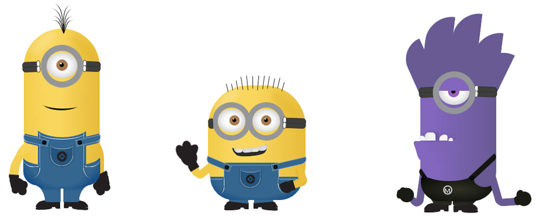
Minions in Pure CSS
You guessed it right! We are talking about everyone’s favorite adorable mischievous little minions from Despicable Me drawn and animated using CSS3. Each character details like hair, eyes, mouth, clothes and limbs are divided into separate HTML elements and styled via pseudo-elements. This brilliant work was created by Amr Zakaria just for fun. Kudos! Check out the CSS minions by clicking on the button below.
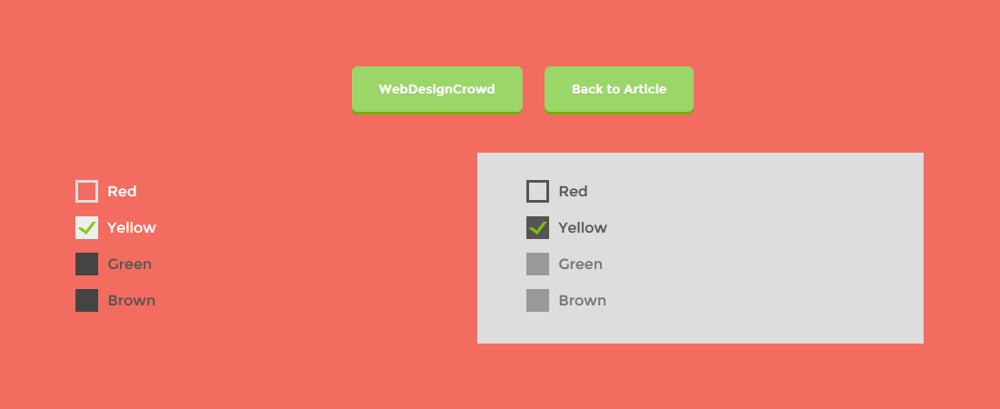
Create Custom Checkbox Using CSS3
When it comes to styling HTML checkboxes, our options are somewhat limited to the way browsers (and OS) render them and we may have to rely on bloated JS plugins to make things work across the board. That’s the old-school stuff. With CSS3 and some clever pseudo elements usage, you can create almost any kinds of fancy custom checkboxes as demonstrated by webdesigncrowd. In this demo, the HTML checkbox is hidden from view and all stylings are applied on the <label> taking advantage of its :before and :after pseudo elements to emulate a checkbox appearance with fancy transitions. Click here to view a similar demo.
Picnic CSS: CSS library
Picnic CSS is a CSS library containing pre-styled buttons, form, table, grids and nav created by Francisco Presencia. Picnic CSS is really handy when you are building a new website from scratch and want to speed up your styling time. It works by having most of the basic HTML elements already styled with minimal or no CSS classes. The author affectionately describes this feature as “invasive” for its tendency to mess with other CSS styling you may have. Luckily, in the Sass version there’s a flag that you can set to disable the “invasive” nature of the library.
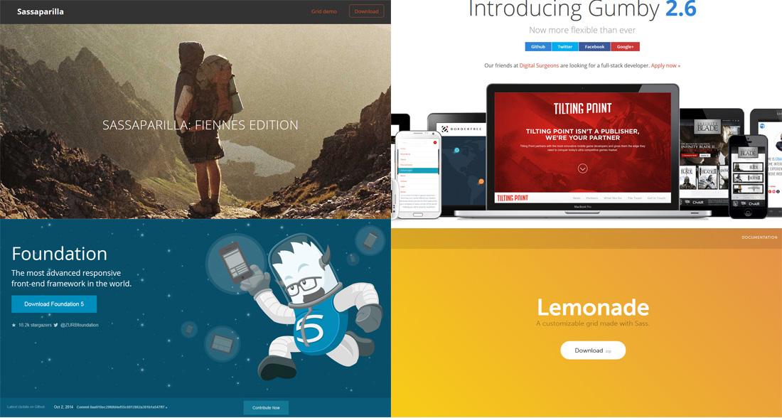
Sass-based Grid Systems
A solid grid system is essential in building a semantic and flexible website structure. One of the best grid systems I’ve been using for a while is Bootstrap. Many grid systems exist today; some are pure CSS and some has built-in JavaScript that allow web-developer to style a website instantly by calling the proper class names. For something more extensive, check out Sass-based grid systems that enables you to get the most out of advanced Sass features such as variables, mixins and nesting. View more to find out about the Sass-based grid systems.
CSS Best Practices
Heydon Pickering has shared his slide deck on the definition of CSS best practices. In this presentation, he offers a look at the conventions and processes we incorporate into making web content presentable and how they affect users of our products. According to him, one of the best practices in doing CSS would mean having a method of creating or producing by optimising the quality of a CSS file, where the file would be able to be read easily and maintained by other front-end developers. Hit on the button to learn more.
 Stampede Design