Recently, Twitter has updated their fav button to an animated fav button. The key to producing this effect is by using CSS animation steps timing function. How it works? The general concept of this implementation is similar to zeotrope devices which display a sequence of illustrations showing progressive phases of that motion. In this demo by Donovan Hutchinson, the key frames are placed equally spaced in one line in a single image file, and we control it using transition from the first to the last frame by positioning the background. Hit the button below to learn more.
All posts filed under “CSS”
All the CSS-related tutorials, ideas and various posts in Stampede Constructs
Table Row and Column Highlighting Using CSS
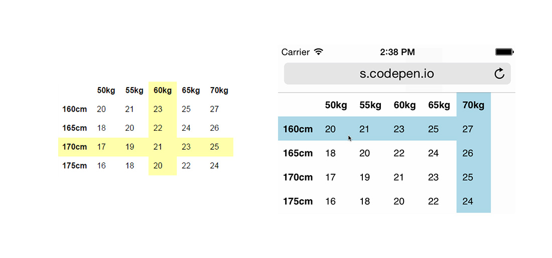
Highlighting table rows on hover is pretty straightforward to do in CSS using tr:hover. Table columns on the other hand are somewhat tricky because columns don’t really have a parent container that you can target. Worry no more, Chris Coyier has came up with a fine CSS solution to this front-end developer conundrum by taking advantage of pseudo elements and negative z-index. With a dab of JavaScript the whole thing can be made to work on touch devices too. Hit the button below to learn more and view the table row and column highlighting demos.
CSS Counters
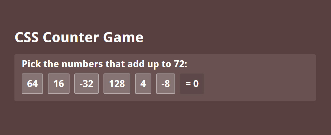
CSS counters can easily qualify as one of those CSS features that not many of us had ever use or even heard of. With CSS counters you can have a running numerical counter all in CSS. You can think of it like an HTML ordered list tag but with more control. While real world usage may not be so practical or straightforward, this article by Will Boyd showcases some really cool things you can do with CSS counters.
Below is the most basic implementation:
body {
    counter-reset: pages; // initialize counter with a variable called "pages"
}

a {
    counter-increment: pages; // increment counter for every <a> tag
}

a::before {
    content: counter(pages); // display counter
}
Hit the button below to learn more and hopefully you’ll get inspired.
CSS Color Introduction
The discussion on CSS colors might sound like a trivial subject however that’s actually far from the truth. Six Revisions author Jacob Gube has written a detailed explanation on different methods to declare CSS colors which are:
- Hexadecimal notation – Hex color code start with hash (#) and followed with 3 characters or six characters of number, alphabet, or combination of number and alphabet.
- RGB – RGB stands for Red, Green, Blue. Minimum decimal value is 0 and maximum decimal value is 255.
- RGBA – Similar to RGB. The additional “A” (alpha) is for specifying the level of transparency of your color. Value of alpha can be set between 0 to 1.
- HSL – Stands for Hue, Saturation and Lightness. The HSL color notation is an alternative to the RGB color notation. It was introduced to CSS with the idea that it’s more intuitive to learn compared to the RGB color system.
- HSLA – Like in RGBA, the A represents the alpha value for transparency.
- Color keywords – Basic color names like
blue,maroon,blackandwhite. In CSS3, the number of keywords were extended to include fancy color names likeroyalblueandkhaki.
Hit button below to read the detailed explanation.
How to Create Ghost Buttons Using CSS
Have you heard about ghost buttons? This is perhaps a common term for designers and you probably have seen a ghost button in action without knowing one. The ghost button first gain traction and became a trend in 2014.
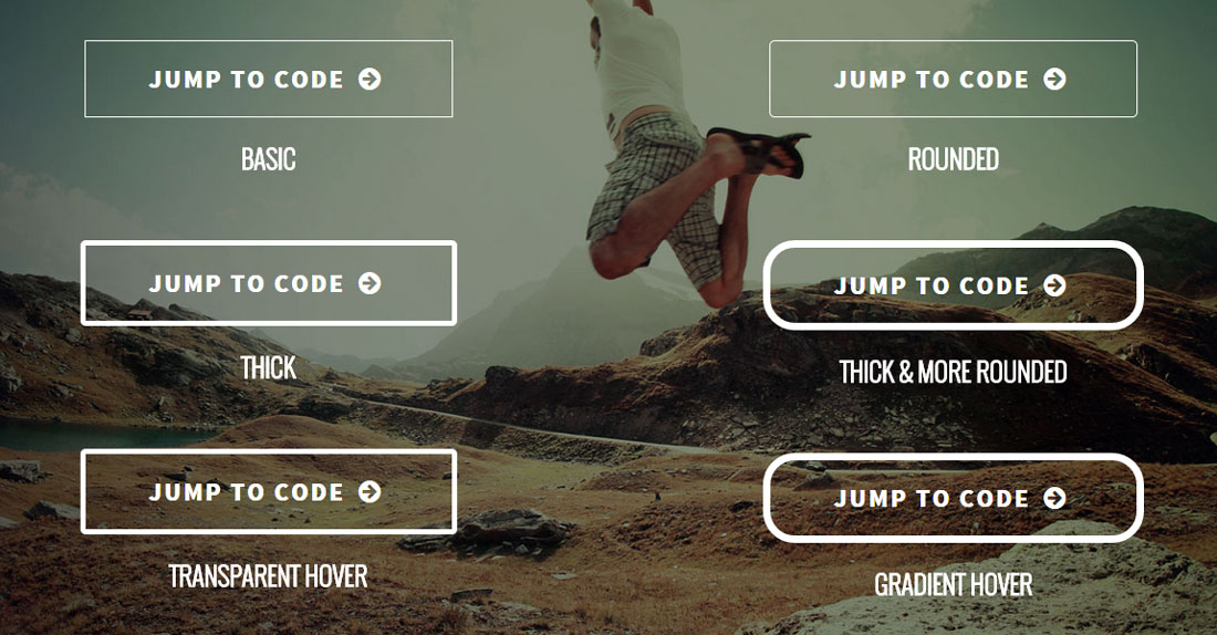
So what is a ghost button? The most basic and common ghost buttons style is a transparent button with solid white border and white text. The padding is often generous and border thickness varies depending on the design style. Due to the transparency, whichever image or elements behind it will naturally become the background of the ghost button. This is popularly used as the call-to-action for hero images (often huge banner at the very top of your page) or as a more minimalist alternative to huge, blocky, high-contrast buttons that are trying too hard (according to our Stampede designers!).
CSS Animation Intro to Beginners
Animation has been a key part of websites since the early days. They could be in many forms such as GIF, SVG, background video and etc. Now that browser support has improved across devices, CSS animations has gained some traction in the web design world. In this Tuts+ tutorial, Catalin Miron showed us how to create animations using purely CSS. The main component of CSS animations are @keyframes which contains the animation rules and animation which contains properties to control the animation style. Hit the button below to learn more.
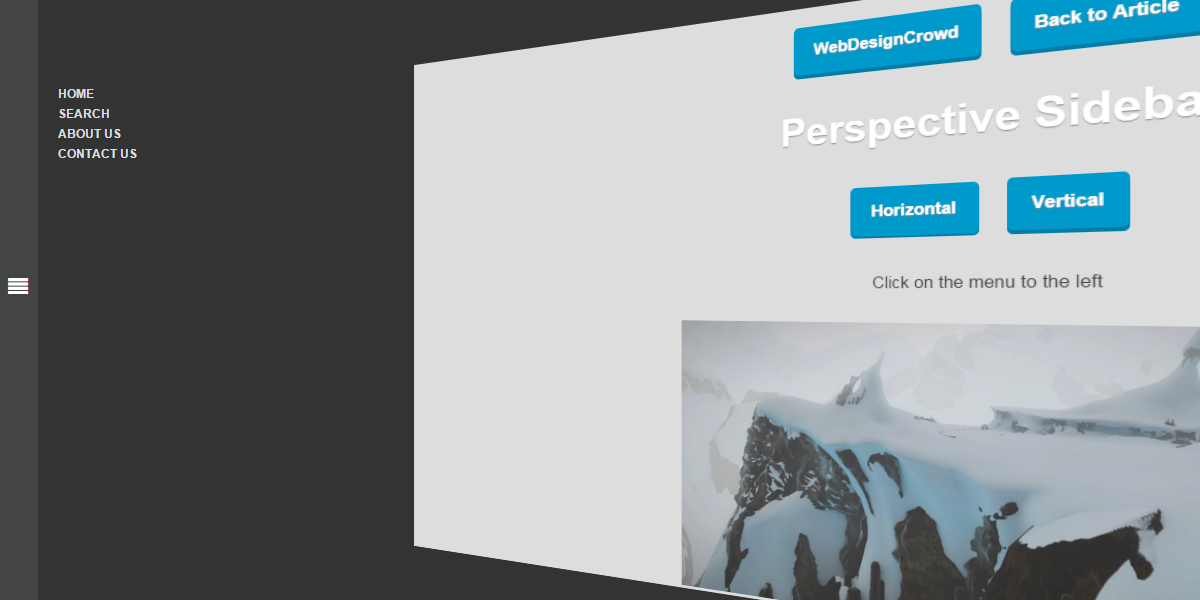
Animated Perspective Menu Using CSS3
With CSS3 technology, many creative styling and effects can be created. In this post by WebDesignCrowd the author experimented with animated perspective menu style using CSS3. This cool and unique tutorial was built using HTML, CSS and a dab of jQuery for toggling classes. The HTML structure was divided into two sections; the menu and content. The combination of perspective and transform CSS properties are the key that enables the tweaking of position and perspective of the content. Anyhow, this unique effect can only be viewed in webkit browsers for the moment.
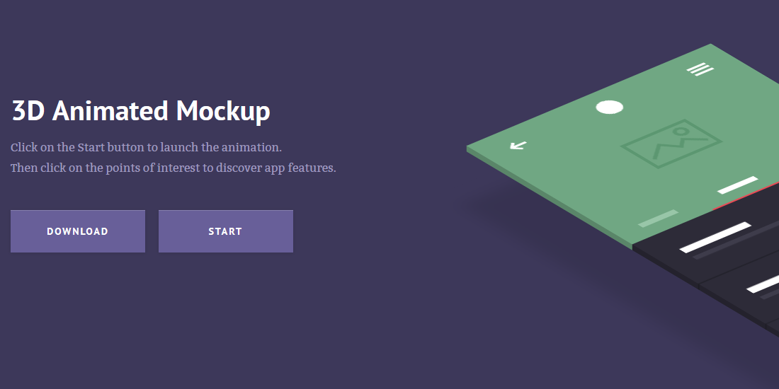
3D Animated Mockup
Inspired by prismic.io, Claudia Romano has created a demo and tutorial called 3D Animated Mockup, useful for showcasing your application features. The smooth 3D animation was created using CSS and jQuery and is supported by most modern browsers nowadays. This responsive website will turn to desktop version when reaching 1170px breakpoint. Starting at 1170px, you will see a smoothly animated 3D mockup after clicking the Start button. Also featured in the demo is the Points of Interest clickable tooltips for highlighting the points of interest of your products. Hit the button below to view the tutorial and demo.
Create Text Background Image and Text Gradient
If you think solid color text is too mainstream, do read on. Chris Sevilleja has created a tutorial on how to place a background image or gradient to regular text and even better, animate it! The important CSS property to make this happen is -webkit-background-clip, which means this technique is only limited to webkit browsers. In the demo, the main <h1> text is given background-image, -webkit-background-clip:text; and -webkit-text-fill-color:transparent; CSS properties. Without -webkit-background-clip:text;, the image would just appear like a regular background. -webkit-background-clip:text; works by clipping the background image into text and finally to make the text color transparent, we use -webkit-text-fill-color:transparent;. Hit the button to read more and view the rest of the demos.
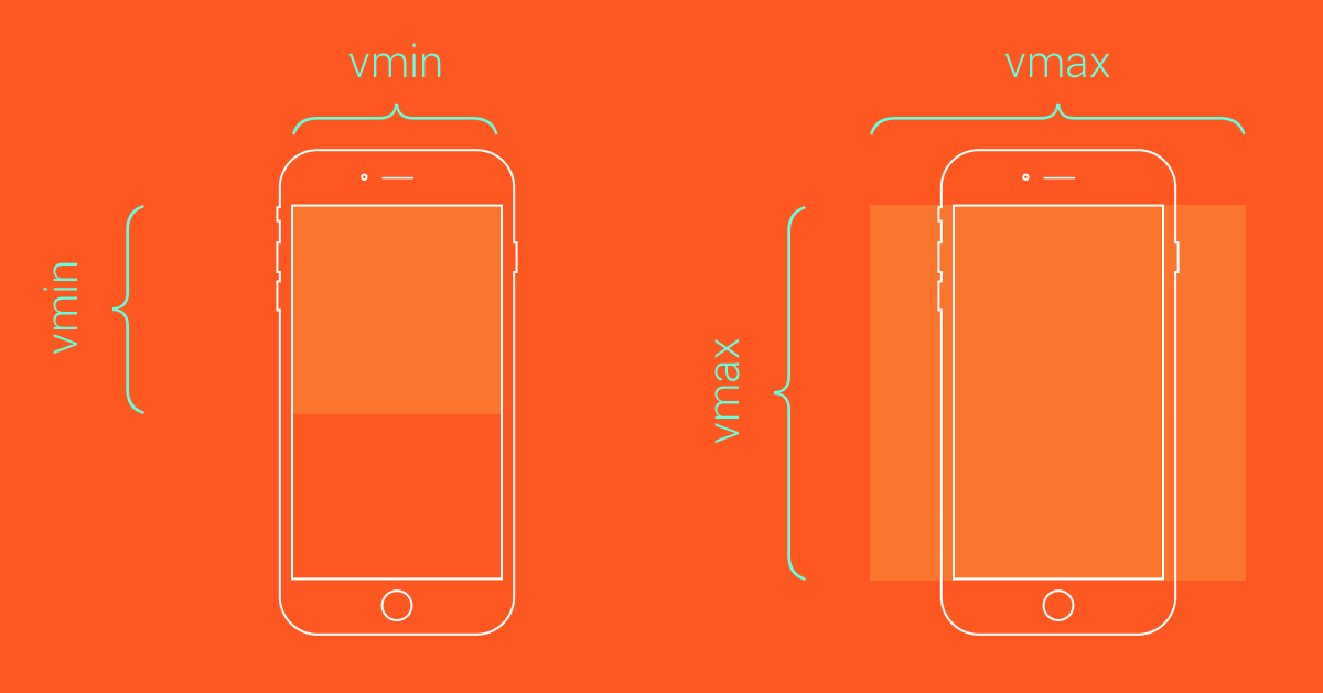
The Rarely Used CSS Units
Jonathan Cutrell from Tuts+ shared a great post about seven CSS units of measurement that you might not know about yet simply because they are rarely used in front-end development. The usual px and em measurement units are totally fine but you will be in great advantage if you know about a couple of these lesser-known units especially when coding a responsive website. The CSS units mentioned in Jonathan’s article are rem, vh, vw, vmin, vmax, ex and ch. rem, vw and vh are supported by IE9+, vmax by IE11+ and vmin is actually “vm” in IE9. ex and ch meanwhile are only supported in newer Google Chrome.
 Stampede Design