All posts filed under “CSS

All the CSS-related tutorials, ideas and various posts in Stampede Constructs

comment 0

10 Free CSS Hamburger Menu Animations

The hamburger symbol consists of three parallel horizontal lines placed on top of one another (resembling a hamburger). It is popularly used as a menu access button in graphical user interfaces and is often displayed in the top left or top right corner of the screen.

Here is a collection of 10 hamburger menu animations made with pure CSS. It includes full SASS files and comes with accessibility support.

Get some hamburgers

comment 0

Foundation 6.2 vs Bootstrap 4 (A Framework Comparison)

Foundation and Bootstrap are the most popular CSS frameworks nowadays. Both have recently released new versions; Foundation with 6.2 and Bootstrap with 4 (Alpha). The frameworks have a new Grid system using flexbox that can be enabled or disabled at your choice.

A good question between these two frameworks is ‘which one should we use’? It really boils down to what type of project you are working on and how much you enjoy working with each respective framework.

What’s the difference?

comment 0

Foundation for Emails 2

Ink (also called Foundation for Emails) is a HTML email development framework that is built around the best email practices. In the era of smartphones, people are frequently checking their emails on their mobile devices and that means the need for a responsive approach to emails.

Enter Foundation for Emails 2, Ink’s successor. This upgraded framework is mobile-ready and allows developers to quickly create responsive emails that work (even on problematic email software like Outlook).  Developed in 2015, this new version focuses on quicker layouts, colors and styles. Foundation for Emails 2 borrows many components, best practices, and workflows from Foundation for Sites. Foundation developers new to HTML emails will feel right at home with this..

More details on 2.0

Flexbox for Comments Section
comment 0

Flexbox: How to Create a Responsive Comment Section with HTML5 and CSS3

Flexbox (Flexible Box) is a method that aims to provide a more efficient way to build powerful dynamic layouts by efficiently laying out, aligning and distributing space among items in a container. It can be implemented on all sorts of modules but is best on smaller sized web apps.

If you ever needed it applied on a comments section of your website, here’s a detailed explanation on how it can be done.

More details

Ionic
comment 1

Getting Started With Ionic

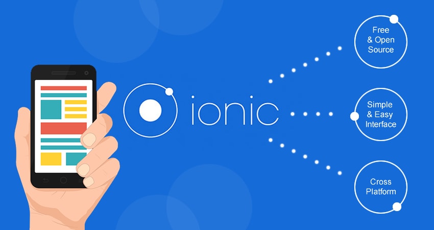
As a web developer, have you ever wanted to build a mobile app quickly using what you already know? Ionic was made for this very purpose. It is a framework that allows you to build hybrid mobile apps using HTML, CSS and JavaScript. Hybrid apps have benefits over pure native apps in that it has a faster speed of development and also access to 3rd party code.

Ionic is also a completely free and open-source framework which makes use of AngularJS for creating highly interactive apps. All you need to do is install the node and get started.

Let’s build some mobile apps!

comment 0

Pushing the Limits of :visited with CSS Blend Modes

Web designer Stelian Firez shares a neat trick making clever use of CSS blend mode to de-emphasize background image icons on visited links. The reason why the usual opacity or rgba codes cannot be used to dim images is because browsers limit the number of CSS properties that can be applied to visited links, for privacy reasons. Stelian’s workaround comes from his experience designing in Photoshop, whereby he sets background-blend-mode:screen; and background-color:#000; to all icon links and then applying background-color:#ccc; to the :visited pseudo element. Click on the buttons below to read the full post or view the demo.

Learn More View Demo

Filed under: CSS


comment 0

Buffer’s loading animation in SVG and CSS

One of the subtle yet original UI elements you can add on your website or app are custom loading indicators or animations. In this post at CSSanimation.rocks, the author de-constructs the loading animation the webapp Buffer uses when users are signing in. Buffer’s approach is straightforward where it utilizes a simple GIF image that got swapped out with a static PNG logo when the loading completes. This tutorial takes it up a notch by reproducing the loading animation using CSS and SVG. The end result is a scalable, retina-ready loading animation at the fraction of the GIF file. This is a great tutorial if you are new to SVGs and CSS animations. Click the buttons below to learn more or jump straight to the demo.

Learn More View Demo

Filed under: CSS


CSS Sprite Animation
comment 0

Create Smooth CSS Sprite Animation

CSS sprites are usually used in situations that involve hovering over an element to manipulate the sprites. With CSS keyframe animation that is running infinitely, sprites can be made to animate almost like a GIF, but with finer control. In this inspirational Codepen demo by Avaz Bokiev, the sprites are animated using CSS continuously without needing any hover interaction. The animation can be stopped using a checkbox and you can control the sprite to animate forward or backward. Check out the CSS sprite animation demo by clicking on the button below.

View Demo

Filed under: CSS


Realistic Text
comment 0

Kinda Realistic Text Rendering

Ever wondered how to produce a kinda realistic text rendering on the web using CSS? Check out this brilliant Codepen demo created by Lucas Bebber. The result convincingly looks like a camera shot of some text from a newspaper or a book. This realistic text effect is accomplished using mostly CSS. The trick is overlaying three or more slightly transparent objects and using 0.3 degrees rotation variation between each layer. Hit the button below to see the demo and codes.

View Demo

Filed under: CSS