By using some SCSS tricks, Jesse Couch shows how to create fancy text transition effects triggered by what he called “advanced hover or touch states”. The transitions are done using text-shadow and box-shadow. We imagine this could be super useful for designing interaction on both computer or touch-screen devices, so let us know what you think.
All posts filed under “CSS”
All the CSS-related tutorials, ideas and various posts in Stampede Constructs
Lemonade Responsive Framework
5 Unusual Things That Are Built With Only CSS
Every web developer knows CSS is typically used to style HTML elements but have you ever wondered if it is also possible to employ CSS to perform tasks otherwise done through JavaScript? The answer is yes. Although it will not completely replace JavaScript’s function features, with a little creativity and trickery, CSS could be a quicker, easier and comparable solution. In his article, Trevan Hetzel has shared 5 things you won’t believe are built with only CSS. There are some usability disadvantages as highlighted by a commenter but give it a spin and see if you could improve it.
Pure CSS Image Comparison Slider
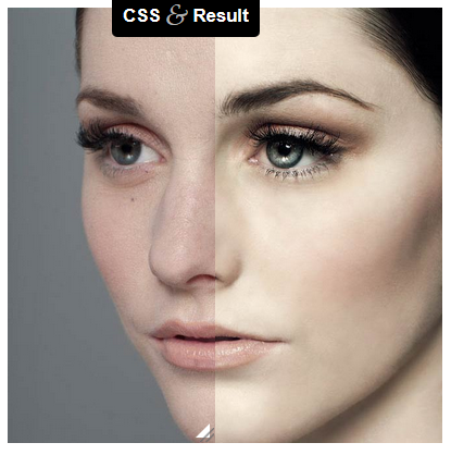
An image comparison slider is a good design approach allowing user to compare differences between two images. After seeing post about “Before and After” by Dudley Storey, Lea Verou has created an experiment to create the same effect by using minimal and purely CSS code without JavaScript. The original markup shows images as CSS backgrounds, so it posed a problem for screen readers. Instead, Lea overlaid a div on an image and made it horizontally resizable through the resize property. Take a look at the CSS image comparison experiment and let us know what you think.
Better Image Animation using CSS Keyframe
Animation is a sure way to get people’s attention. There are several ways to create animation and by far the easiest is by using GIF. Animation done by GIF requires no coding at all but while the method is easy, it also results in typically huge file size and poor quality picture. There is a better way to do this using the CSS keyframes method. Today we feature an experiment by Joe Howard that shows you how to produce web animation using CSS keyframes.
5 Things Front-End Developer Should Learn in 2014
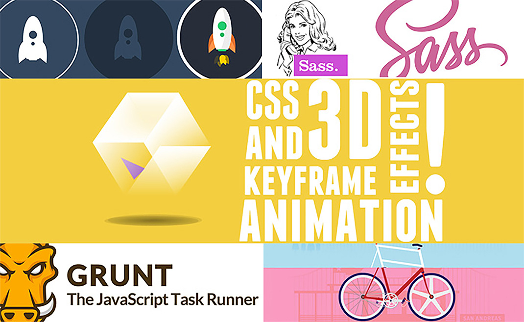
The web industry operates at a breakneck speed and so all front-end developers must continue to learn and keep up to date with the latest trends, methodologies, languages and techniques. In this compact yet excellent article by Joe Howard, you will find 5 useful skills you could master this year that will help you remain at the forefront of the latest web development know-how. Think SASS, Grunt, SVG, CSS animation and custom parallax.
Swing Text Effect
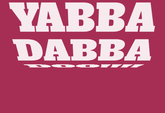
Mladen Stanojevic did this bold and cool swing text effect using a combination of HTML, CSS and JavaScript. You could change the swing direction, animation speed and other properties. This will look great on a landing page, so give it a try.
Responsive Modal Window
In my previous post I have shared a tutorial showing how to create a simple modal window. Now it is time to learn responsive modal window. Going responsive allows your modal window to respond to screen sizes, eliminating the awkward pinching and zooming out your user has to do with regular modal windows. See how Sawyer Bateman did it.
Pagination: Drag and Type User-Friendly Pagination
Pagination is often used in blogs where there are many content to display, yet you have to limit number of content per page to prevent long page load. Pagination also allows user can navigate to next, previous or any page they want. Simon Goellner has created an improved, responsive and accessible pagination experiment where user can now drag or use arrow key to get to their desired page. It’s really cool, so have a look!
Fancy a Pac-Man CSS Loader?
A loader is used to show progression of website when loading data from web server. Usually loader comes in the shape of a spinning animation. But this time for something different, learn how to make a Pac-Man CSS loader in this tutorial by Damien Erambert.
 Stampede Design


