All posts filed under “CSS

All the CSS-related tutorials, ideas and various posts in Stampede Constructs

CSS Pseudo Elements
comment 0

CSS Pseudo Elements

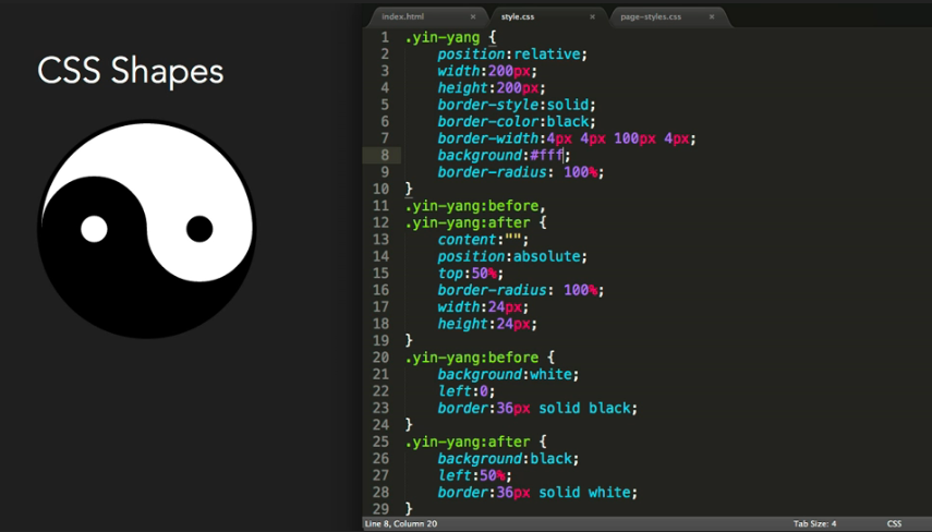
Guy Routledge from atozcss is a big fan of using CSS pseudo elements as he could do a lot with them and add all sorts of visual flair to the page without cluttering up the markup. In this 6:36 minutes video, he is going to talk about:

  • The five different CSS pseudo elements
  • Generating content like text, images attribute values and counters from CSS
  • And how to make complex shapes with minimal markup

Be sure to also check the transcript and code snippets for this video in the link itself. Enjoy!

Watch the video

Filed under: CSS


SVG Responsive
comment 0

CSS: Make SVG Responsive

SVGs are pretty great when it comes to creating responsive resolution-independent logos and other graphics. An SVG can be embedded on a web page in many ways, as follows:

  • Inline embed in an HTML5 page using the <svg> tag
  • Embed SVG as image using the <img> tag
  • Embed SVG as image using the <object> tag
  • Using an iframe
  • As a CSS background image

In this brilliant article by Sara Soueidan, she covers embedding techniques, how to apply the “Padding Hack” and how to use inline media queries to make SVGs responsive.

View More

Filed under: CSS


CSS Selectors
comment 0

How CSS Selectors Work

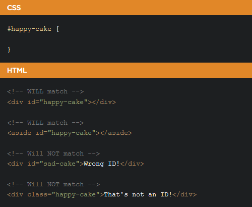
The biggest key to understanding CSS is understanding selectors. Selectors are what allows you to target specific HTML elements and apply styles to them. Suitable for beginners in the web industry, Chris Coyier from css-tricks has published an article about understanding how CSS selectors would work. This article covers, among others – what  the available selectors are, how to choose and use selectors in right way. Hopefully you’ll find it useful!

View More

UI Accordion Menu
comment 0

Accordion Menu With Sliding Tiles

In my previous posts, I have already shared 2 posts about a number of demos and tips on creating an accordion menu. This time, I would like to share a demo of a sliding tiles accordion menu, a brilliant experiment by Wifeo. The logic behind this demo is actually quite straightforward. The tiles each respond to mouse over and slide to the sides to reveal text corresponding to the active tile. Wifeo achieved this through CSS visibility property to show and hide the text and transition for sliding the tiles on hover. Try it out!

View More

side hamburger menu
comment 0

Side Hamburger Menu With Animation

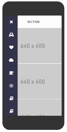
Nice demo by Gianmarco about creating animated side hamburger menu with a number of categories to choose from. Users can click on the hamburger icon for the menu appear and click “x” button to close the menu. However, this feature currently fully works in Chrome only, while it may seem lagged for the other browsers.

View Demo

comment 0

Tips To Fix CSS Layout Issue

Pulling your hair dealing with CSS layout issue?

Here are some tips to fix common issues with CSS layout

View Source

Fix css layout issue - Unclosed Tags
Try to view source (CTRL+U on FF) on your browser. This is the best tools to check if all tags are properly close or if you have duplicate IDs on one same page. Most of the times, this is the culprit.

Inspect Elements

Fix css layout issue - Inspect Element
Another great tool. Try delete your suspected element that caused layout issue using inspect element. This way, you can focus to fix only that element.

Clearfix

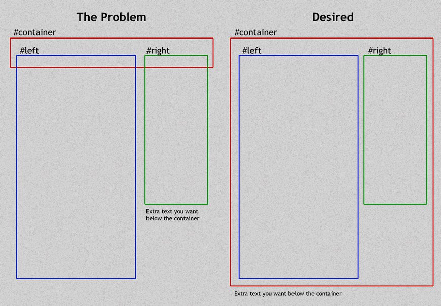
Clear your floating container using clearfix. When you have floating elements, don’t forget to add clearfix for the container. View full explanation about floats and clearfix by Chris Coyier.

/* A clearfix is performed as follows: */
.clearfix:after {
   content: " "; /* Older browser do not support empty content */
   visibility: hidden;
   display: block;
   height: 0;
   clear: both;
}

/* Or, if you don't require IE<8 support, the following is fine too: */
.clearfix:after {
  content: "";
  display: table;
  clear: both;
}

/* HTML with clearfix */
<div style="float: left;" class="clearfix">Sidebar</div>
<!-- No Clearing div! -->

Do you have other tips on fixing CSS layout issue? Comments are welcome!

text select effect
comment 0

CSS: Text Select Effect

Usually when the user selects a text or the whole paragraph, a highlighted effect will appear with white background along with the font highlighted in blue, or any other colours for that matter. With this feature from Ahmad Anas codepen demo, highlighted text select effect will be replaced with transparent outline font by using CSS. Unfortunately this feature is only available for Chrome and Safari for now.

View More

Filed under: CSS


progress button
comment 0

CSS: Candybar Progress Button

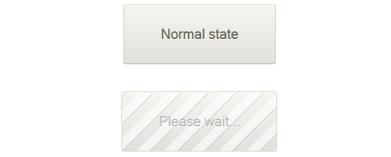
The spinning animated gif is a very common UI element for showing loading state in website interactions. In this tutorial, Cemre Güngör shows a cool alternative candybar loading animation that can be applied on buttons. To see how he creates this progress button, click button below.

View Demo

Filed under: CSS


Icon Filling Effect
comment 0

UI Idea: Icon Filling Effect

Icons are commonly used in user interface to communicate a message quickly and to support textual content. When done right, it serves more than eye candy and actually helps readers to maintain eye tracking as they scroll down a website. But what if we can produce icons with effects that transcend their usual static properties? Inspired by the cool icon filling effect of vertical timeline on Elliot Condon’s websiteSebastiano Guerriero from codyhouse showed us how to achieve the same effect with a little help from transparent icons. Though it requires some advanced CSS techniques, it’s worth to learn and is perfect for one-page website. Using this icon filling effect, you are now able to piqué readers’ interest and guide them from one section to the next. Well done, Sebastiano!

See how it’s done   View Demo

Pure CSS parallax effect
comment 0

Pure CSS Parallax Effect

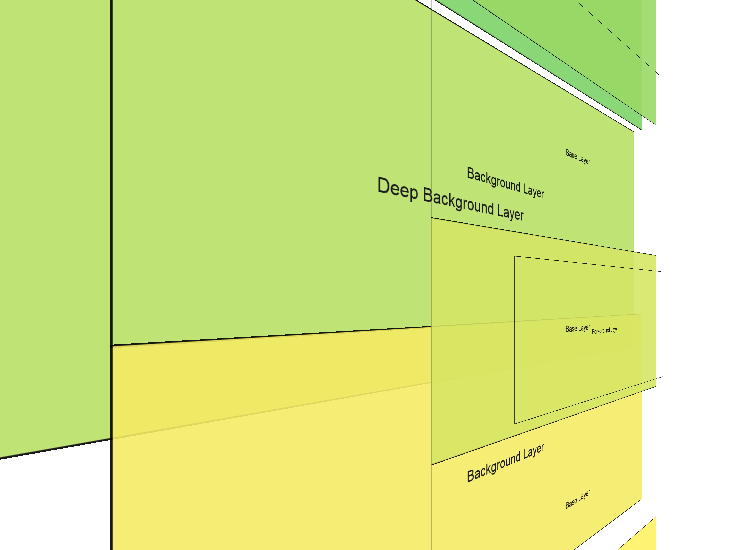
Parallax effects are almost always handled with JavaScript and, more often than not, the result is not very impressive. In his blog post, Keith Clark found a way to achieve pure CSS parallax effect thus removing all the web performance issues. The result is consistent frame rates and perfectly smooth scrolling. You can also combine the effect with other CSS features such as media queries or  supports. When used for the right purpose, CSS parallax effect engages user better and gives them that extra delight while scrolling down your website. Learn more on how Keith does it, along with some demos.

See how it’s done   View Demo

Filed under: CSS