All posts by “Sani Halid

training the cms
comment 0

6 Tips to Write Better Code

It is important to write clean, organized and easy to understand code. This not only will help you but also other developers when they have to look at your codes in the future. In this SitePoint blog post, front-end developer Tim Evko shared a couple of tips on how to write better code. They can be summarized as:

  • Start building modules
    Write common features as separate, reusable modules and then merge them into a single file for the final product.
  • Learn to use preprocessors
    Using a preprocessor can help you save time by eliminating the need to write the same repetitive code multiple times.
  • Plan before you write
    Plan everything before starting to code. It will prevent you from rewrite some code when realize something missing during halfway of your work.
  • Use version control
    Version control is a system that records changes to a file or set of files over time, allowing multiple users to edit, track changes, and host assets. Very useful when working in a team.
  • Start holding code review
    If you are working with other developers, present some code you’ve written to a group of peers (or superiors) so that you can explain what you’ve written.
  • Take coding challenges
    Brush your coding ability by helping other developers in the community or take random front-end developer challenges such as on Codepen.

Hit the button below to read more.

View More

CSS units
comment 0

The Rarely Used CSS Units

Jonathan Cutrell from Tuts+ shared a great post about seven CSS units of measurement that you might not know about yet simply because they are rarely used in front-end development. The usual px and em measurement units are totally fine but you will be in great advantage if you know about a couple of these lesser-known units especially when coding a responsive website. The CSS units mentioned in Jonathan’s article are rem, vh, vw, vmin, vmax, ex and ch. rem, vw and vh are supported by IE9+, vmax by IE11+ and vmin is actually “vm” in IE9. ex and ch meanwhile are only supported in newer Google Chrome.

View More

Filed under: CSS


sharing button effects
comment 0

12 Awesome Sharing Button Effects

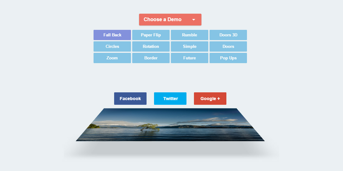
Danny Markov from tutorialzine.com has shared 12 types of sharing button effect demos. These effects were coded mostly in CSS with the transition, transform and filter CSS properties. Only the “Rumble” effect demo was built using a little jQuery plugin called jRumble. If you need a playful-looking effect, this plugin is a must. My personal choice? I love the fall back and the zoom effect. Hit button below to view more or to view demo.

View More   View Demo

Filed under: CSS


mega-site navigation
comment 0

Mega-Menu Navigation

CodyHouse.co co-founder Sebastiano Guerriero shared a responsive and easy to customize mega-menu for large sites, enriched by subtle CSS animations and support for devices with JavaScript disabled. The unique thing about this mega-menu is the sub-items are revealed by slide-in approach instead of becoming an accordion in the mobile version. The slide-in style can also be found in the desktop version. This enables pretty much endless nesting of sub-items in the menu. Sebastiano created the mega-menu using a combination of HTML, SASS and jQuery. The HTML structure are broken into four main sections; <header>, <main>, <nav> and <div>. He kept the containers separate because they are much easier to handle in mobile devices. In bigger screens, the containers are all moved inside <header> using jQuery. View the full structure and style by hitting the button below.

View MOre   View Demo

Filed under: CSS


hover transition
comment 0

Diagonal Sliding Hover Transition

Fancy a cool-looking image hover transition using only CSS3? Check out this demo by webdesigncrowd.com. When hovering on the demo image, a diagonal shape layer will smoothly slide-in from the edge to reveal extra information about the image. This pretty simple and creative trick was created using two different shape overlays and merged into one shape. The original shapes are triangle and rectangle. I think the effect is cool but the amount of HTML needed is kinda bulky. Hit the button below to see the full code and demo.

View More   View Demo

Filed under: CSS


Bootstrap 3
comment 0

Reorder Bootstrap Column on Different Viewport

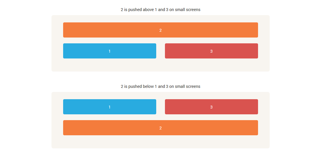
Bootstrap is a 12 grid framework with many great features. One of the understated features of Bootstrap is how you can change the position of grids on different viewports by using a couple of special classes. The grids can be reordered using the push or pull classes. These classes has to be inserted into the standard grid classes such as .col-xs-push-# or .col-xs-pull-#. push will move the column to the right and pull will move column to left. Check out the article shared by Chris Sevilleja to read the full explanation or you can view the demo too.

View More   View Demo

Sublime Text 3
comment 0

Sublime Text 3 Shortcuts Tips for Faster Workflow

If you are you using Sublime Text 3 for coding, this is for you. There are literally hundreds of shortcuts for Sublime Text and you may feel slightly daunted by the taught of learning them. Thankfully Tim Hartmann from Tutsplus.com has written a nice article about his favorite Sublime Text 3 shortcuts to improve your workflow using Sublime Text 3. Some of the tips are; you can have multiple tabs displayed at the same time, super-quick line duplication and create multiple cursors for typing. He also recommended some cool plugins like Hayaku (to help developers write CSS faster) and Markdown Preview (which will allow you to preview documents written in Markdown). Hit the button below to view more.

View More

comment 0

annyang! Speech Recognition For Your Website

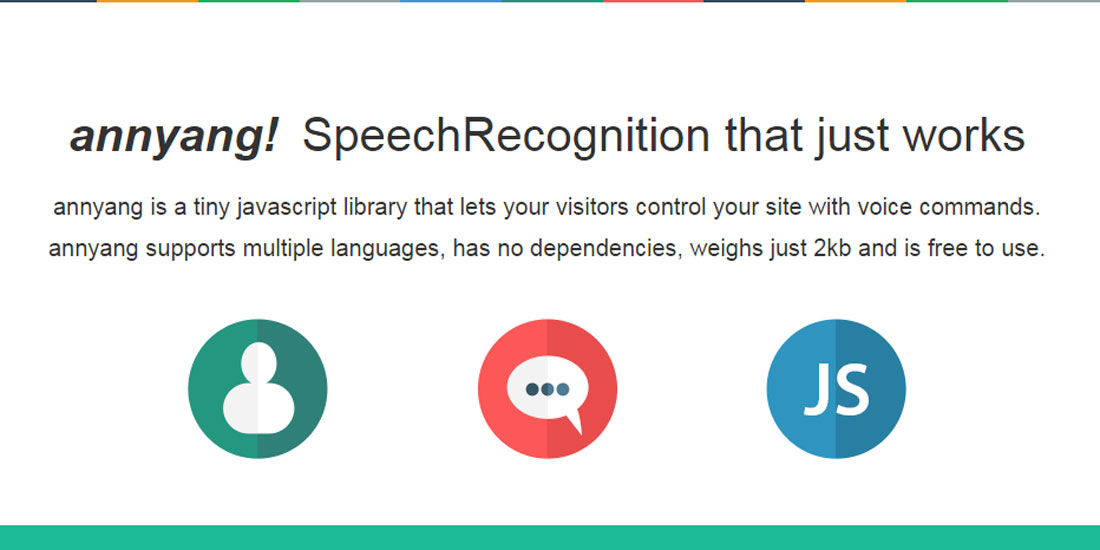
annyang! is a JavaScript speech recognition library created by Tal Ater that lets users control your site with voice commands. Speech recognition is one of the features of HTML5 that allows JavaScript to have access to a browser’s audio stream and convert it to text. annyang! supports multiple languages, has no dependencies, weighs just 2kb, and is free to use and modify under the MIT license. The demo only runs in Google Chrome for now. I did a couple of test runs and the results are pretty accurate. Plug in your mic and give it a try!

View More   View Demo

wobbly slideshow
comment 0

Wobbly Slideshow Effect

“Wobbly Slideshow Effect” is an experimental slideshow effect shared by Mary Lou from Codrops. The slides wobble elastically as they transition to left or right giving the slideshow a cartoon-ish and playful feel. The wobble slideshow is inspired by a concept on Dribble called GIF Exercise by Sergey Valiukh. The trick with the wobbly effect is by animating the slide background SVG using Snap.svg to simulate the elastic effect. The default rectangle SVG path is morphed into right or left curved shapes according to which direction the slide is moving to next.

View More   View Demo

Filed under: CSS