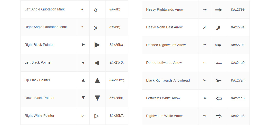
When we think of pretty font icons like arrows, hearts and stars, we think of font icon services like FontAwesome or Fontello. If you are developing a website using only simple shapes, you actually can use unicode symbols as replacement for font icons. The unicodes are essentially part of your operating system so you don’t need any special library or plugin and you treat them like regular text. For example, to change the icon size, simply change the font-size values as usual. Danny Markov from Tutorialzine has shared a very good article on how to use unicode symbol codes. However, unicode symbols have limited icons or symbols. If you want to use many icons in the future for the same website, Fontello is the best option based on my experience. Hit the button below to view the tutorial.
All posts by “Sani Halid”
How to Create Ghost Buttons Using CSS
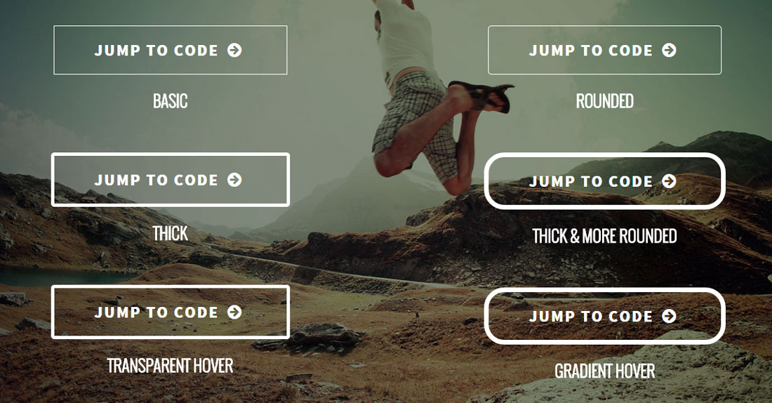
Have you heard about ghost buttons? This is perhaps a common term for designers and you probably have seen a ghost button in action without knowing one. The ghost button first gain traction and became a trend in 2014.
So what is a ghost button? The most basic and common ghost buttons style is a transparent button with solid white border and white text. The padding is often generous and border thickness varies depending on the design style. Due to the transparency, whichever image or elements behind it will naturally become the background of the ghost button. This is popularly used as the call-to-action for hero images (often huge banner at the very top of your page) or as a more minimalist alternative to huge, blocky, high-contrast buttons that are trying too hard (according to our Stampede designers!).
Create Blinking Text Using CSS3 and jQuery
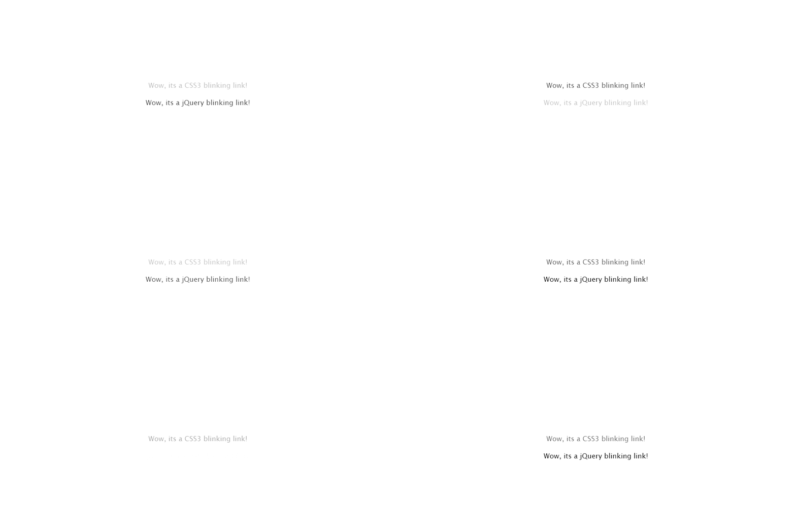
Learn how to create blinking text using either CSS3 or jQuery. Nikul Lakhani from CSS-Diary demonstrated a pretty easy way to do this. For CSS, the trick is using CSS animation and @keyframes to control the timing that toggles the opacity back and forth. The jQuery method is much more simpler using only few lines of built-in methods fadeIn() and fadeOut() to blink the text. Hit the button below to learn more.
CSS Animation Intro to Beginners
Animation has been a key part of websites since the early days. They could be in many forms such as GIF, SVG, background video and etc. Now that browser support has improved across devices, CSS animations has gained some traction in the web design world. In this Tuts+ tutorial, Catalin Miron showed us how to create animations using purely CSS. The main component of CSS animations are @keyframes which contains the animation rules and animation which contains properties to control the animation style. Hit the button below to learn more.
SVG Drawing Animation Using vivus.js
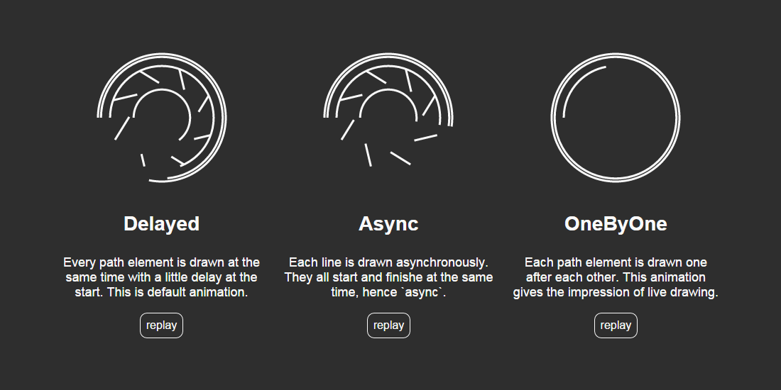
Vivus.js is a lightweight, standalone JavaScript class that allows you to animate SVGs, giving them the appearance of being drawn. A couple of preset animations are available called Delayed, Async and OneByOne, but the library also allows you to script the entire SVG drawing animation whatever way you want. By using one of the built-in animations you can simply use this library in just one line of code like new Vivus('my-svg-id', {type: 'delayed', duration: 200}, myCallback);. The vivus.js constructor takes three parameters; ID of the SVG to animate, option object and callback to call at the end of the animation (optional). A more advanced usage is via scenario where you can define at what frame an animation must start and for how many frames it will last. Hit the button below to learn more.
Animated Perspective Menu Using CSS3
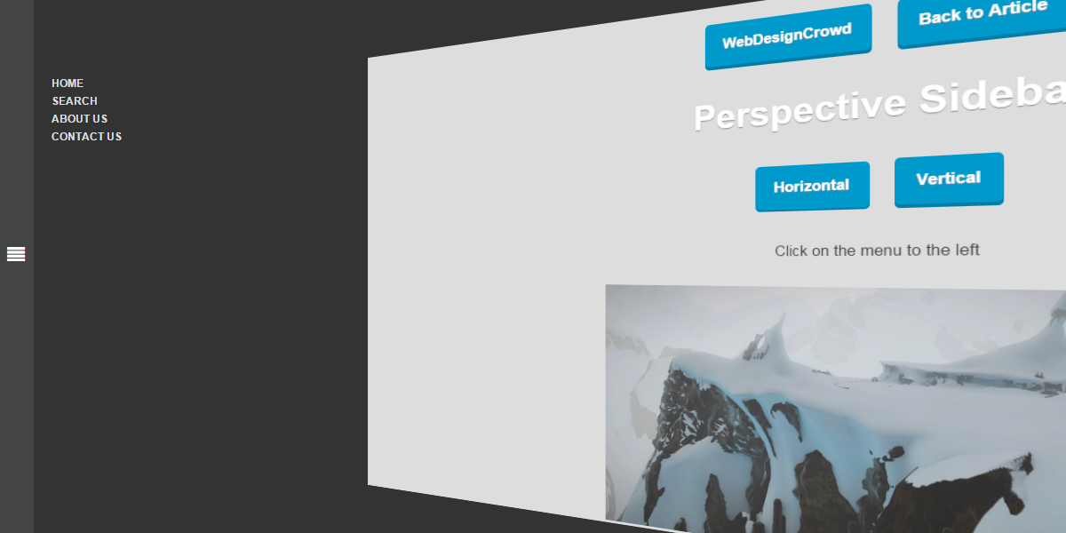
With CSS3 technology, many creative styling and effects can be created. In this post by WebDesignCrowd the author experimented with animated perspective menu style using CSS3. This cool and unique tutorial was built using HTML, CSS and a dab of jQuery for toggling classes. The HTML structure was divided into two sections; the menu and content. The combination of perspective and transform CSS properties are the key that enables the tweaking of position and perspective of the content. Anyhow, this unique effect can only be viewed in webkit browsers for the moment.
Bootstrap Grid System
Bootstrap has to be one of the most popular front-end development framework today. This responsive framework is using a 12 grid system which also happens to be the most important concept in Bootstrap. Bootstrap grid is made up of three things namely a container, rows, and columns. You can create up to 12 grids under one row and remember you can create unlimited rows. Applying this concept when working with Bootstrap will help you create nested grids. If you are new to the Bootstrap grids system, do check out this introductory Sitepoint article by Syed Fazle Rahman about understanding the Bootstrap grid system.
Drag and Drop Interaction
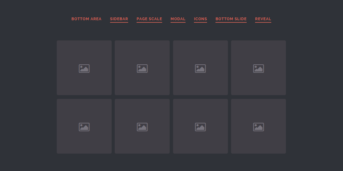
Web designer and developer Mary Lou from Codrops has created a pretty cool drag and drop UI concept to give us some ideas how a drag and drop-based interaction can be implemented in our websites or apps. This concept introduces a ‘droppable’ area that reveals itself as soon as the user started dragging the ‘draggables’. In the demos, Mary showcased the ‘droppable’ areas revealing themselves in seven interesting ways such as sliding from the bottom, sidebar as well as a modal. Example of the applicable scenarios where this can be implemented; think of categorizing and organizing content like in Pinterest boards, mail apps or content management systems. Hit the button below to read more.
3D Animated Mockup
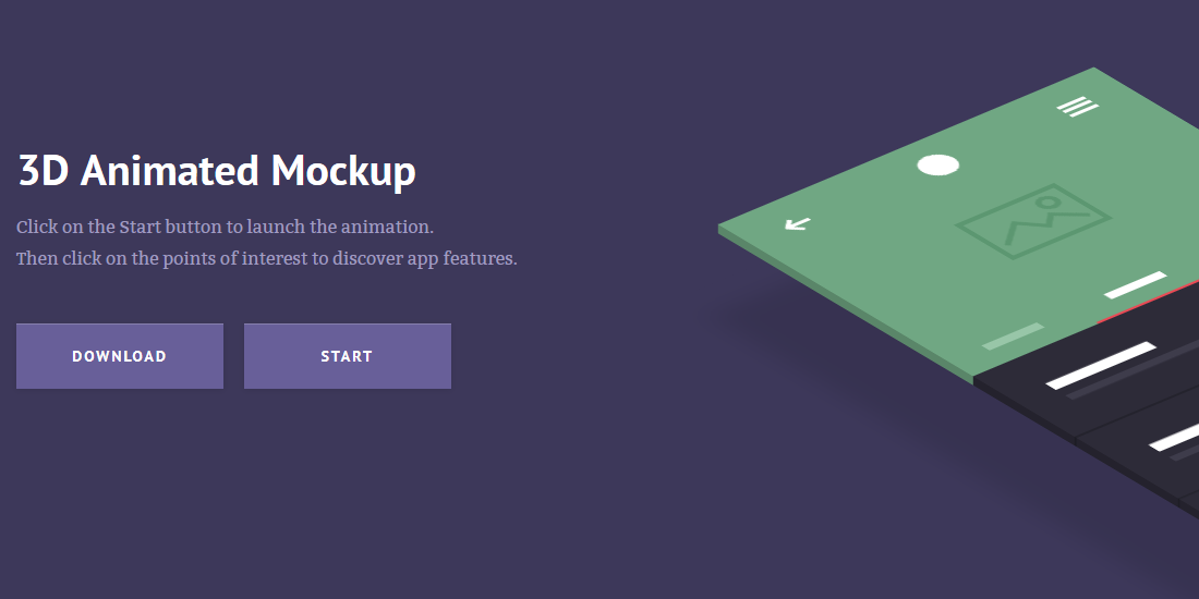
Inspired by prismic.io, Claudia Romano has created a demo and tutorial called 3D Animated Mockup, useful for showcasing your application features. The smooth 3D animation was created using CSS and jQuery and is supported by most modern browsers nowadays. This responsive website will turn to desktop version when reaching 1170px breakpoint. Starting at 1170px, you will see a smoothly animated 3D mockup after clicking the Start button. Also featured in the demo is the Points of Interest clickable tooltips for highlighting the points of interest of your products. Hit the button below to view the tutorial and demo.
Create Text Background Image and Text Gradient
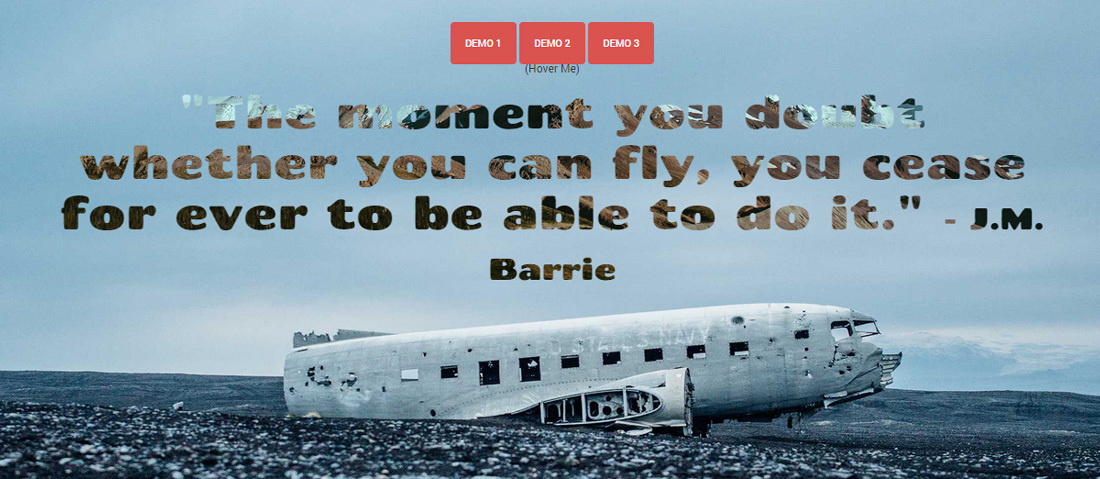
If you think solid color text is too mainstream, do read on. Chris Sevilleja has created a tutorial on how to place a background image or gradient to regular text and even better, animate it! The important CSS property to make this happen is -webkit-background-clip, which means this technique is only limited to webkit browsers. In the demo, the main <h1> text is given background-image, -webkit-background-clip:text; and -webkit-text-fill-color:transparent; CSS properties. Without -webkit-background-clip:text;, the image would just appear like a regular background. -webkit-background-clip:text; works by clipping the background image into text and finally to make the text color transparent, we use -webkit-text-fill-color:transparent;. Hit the button to read more and view the rest of the demos.
 Stampede Design