WordPress.com and WordPress.org – they sound like a website offering the same services, while actually they are quite different. If you are new to WordPress – either one of them (or both!), this is a good read to begin with. In this short article by ithemes.com, we can learn which service actually hosts your website, what each site offers and what you really are paying for. Dive in!
All posts by “Sani Halid”
Better Image Animation using CSS Keyframe
Animation is a sure way to get people’s attention. There are several ways to create animation and by far the easiest is by using GIF. Animation done by GIF requires no coding at all but while the method is easy, it also results in typically huge file size and poor quality picture. There is a better way to do this using the CSS keyframes method. Today we feature an experiment by Joe Howard that shows you how to produce web animation using CSS keyframes.
How to Optimize Your Website PageRank
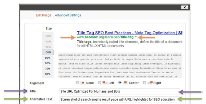
Website pagerank is very important to a website. Higher pagerank means your website is more visible to search engine and guarantees a steady stream of visitors. A typical user would often start their search in search engines like Google, Yahoo and Bing. The first few website links on the first results page is certain to get more attention and clicks than links at the bottom or on subsequent result pages. If content of the first result is not relevant to their search, only then will user click on the other links, although rarely going more than page deep. Most users simply won’t proceed to the next result pages after the first four. In my experience, the second page is often the last resort before I tweak my search keywords in hope of better results.
In this post, Paul Anthony from agconexus.com have recommended a few methods on how to optimize your website pagerank. It might be an old post, but it is very helpful for those who are new in web development industry.
jQuery Plugin: Dynamic Flip Out Card
Once in a while, someone came up with a mindblowing solution to an interface problem. How exactly do you design an overload of information to avoid from overwhelming your reader? Pete from onextrapixel has created Flip Out Cards – a jQuery plugin that lets you display more information by flipping out extra cards without consuming much space. In essence, the plugin gathers all the cards, group them together based on the direction defined (left, right, bottom, and top), position them correctly and hide them out of view. All animations are driven by CSS3, so you could also manipulate class names based on the flip sequence preferred.
My favourite is demo #5, where the card expands in all directions on mouseover. Cool stuff.
5 Things Front-End Developer Should Learn in 2014
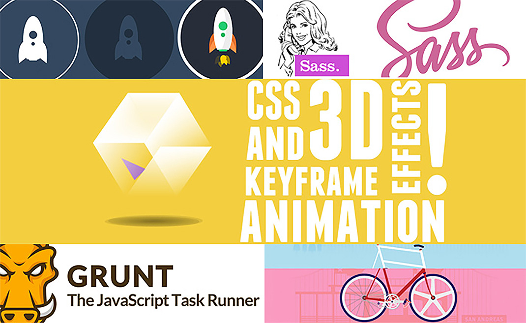
The web industry operates at a breakneck speed and so all front-end developers must continue to learn and keep up to date with the latest trends, methodologies, languages and techniques. In this compact yet excellent article by Joe Howard, you will find 5 useful skills you could master this year that will help you remain at the forefront of the latest web development know-how. Think SASS, Grunt, SVG, CSS animation and custom parallax.
Swing Text Effect
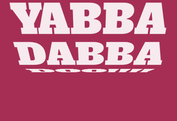
Mladen Stanojevic did this bold and cool swing text effect using a combination of HTML, CSS and JavaScript. You could change the swing direction, animation speed and other properties. This will look great on a landing page, so give it a try.
#TGIF: Old But Gold

TGIF: Old But Gold
Developers Will Understand This – Nerd Humor
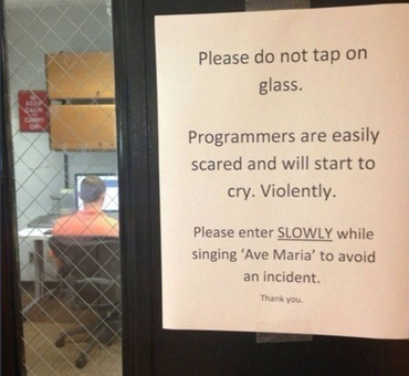
Twenty seven things only fevelopers will find funny. Nerd humor is the best humor.
List of 28 Useful HTML5 Features, Tips & Techniques
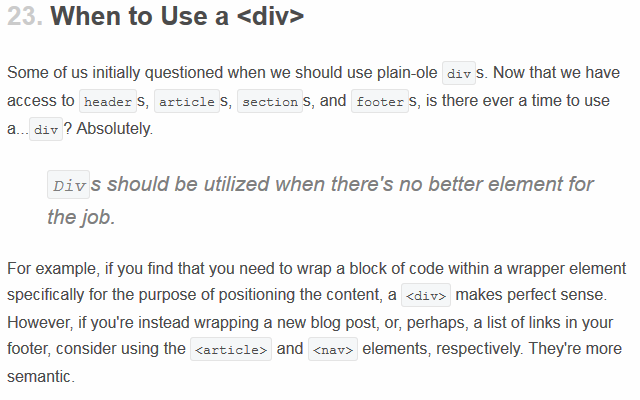
As a web developer, it could get overwhelming consistently trying to keep ahead of the web industry, especially in HTML and CSS. New tutorials and tips are posted everyday. If you are like me, you will find having a definitive list helps. Thanks to Jeffrey Way from tustplus, we now have a list of 28 features, tips and techniques you could use to master HTML5.
Responsive Modal Window
In my previous post I have shared a tutorial showing how to create a simple modal window. Now it is time to learn responsive modal window. Going responsive allows your modal window to respond to screen sizes, eliminating the awkward pinching and zooming out your user has to do with regular modal windows. See how Sawyer Bateman did it.
 Stampede Design

