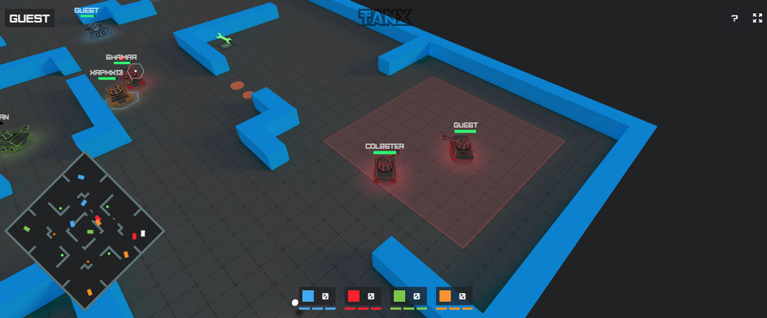
Tanx is an online multiplayer tank shooter game created using PlayCanvas WebGL game engine, Node.JS, WebSockets, Web Audio API and 2D Canvas in a 12 hour hackathon. The objective of the game is to be the first team to destroy 32 enemy tanks on the battlefield. The team members will be assigned randomly as players join the game. You can control your tank with WASD keys and aim/shoot by using mouse or touch joystick on mobile platform. Hit the button below to launch the game in your browser or alternatively you can install it from the Chrome Web Store!
All posts by “Sani Halid”
Create a Narrative 3D-Scrolling Website With Space.js
Space.js is a HTML-driven JS library for narrative 3D-scrolling created by Patrik Göthe. The goal of this experimental library is to explore a new way of presenting content on the web by introducing a new dimension to our usual scrolling behavior. It works by dividing your HTML sections into frames called space-frame and transition them in and out of the screen as you scroll. The default frame transition is to enter by fading in and exit by scaling up and then fading out however you can compose your own transitions using properties like opacity, scale, translate3d and rotation with the API. Hit the button below to learn more or view some demos.
Test Your Eyes Accuracy With Kuku Kube Game
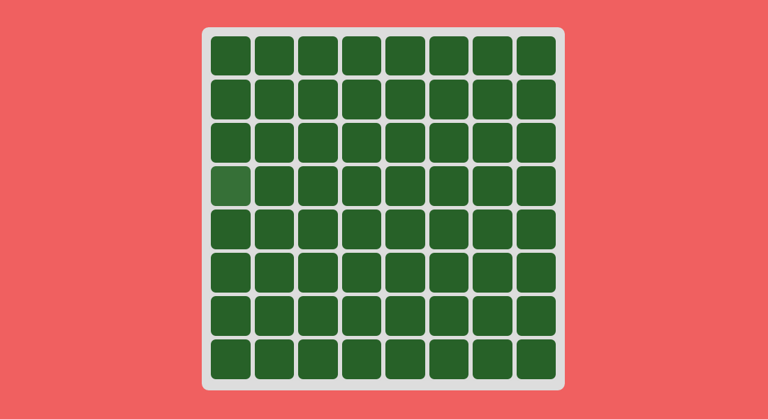
Kuku Kube is a simple looking but insanely challenging color quiz that tests your eyes ability to differentiate shades of color. The game starts out easy with a puzzle containing four huge squares with an odd shade that is easy to spot. As the 1-minute timer ticks and the player progresses, the squares increase in numbers and the odd shades become less obvious that makes you want to max out your screen contrast and brightness. You also probably need to play a couple of rounds to score better. At first try I managed to score a measly 17. My final score was 26. Hit the button below to test your eyes accuracy. You can also try it out on mobile devices.
How to Test Responsive Website on Google Chrome
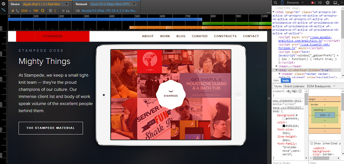
Part of the challenges in developing a responsive website is the testing phase that have to be conducted on devices with many different screen sizes. Of course the simplest approach is simply by resizing the browser size to match the viewport of certain smartphones or tablets. The disadvantage of this method is you cannot truly emulate the unique mobile touch interactions like swipes and pinch to zooms. Fortunately, Google Chrome DevTools has a feature called device mode that’s loaded with helpful tools for testing and debugging responsive designs. Here are the main features of device mode:
- Mobile device emulation
- Touch events emulation
- Media queries inspector
- Mobile network simulation
Hit the button below to learn more on how to test responsive websites in this article by Jacob Gube from Six Revisions.
15 Useful Tips and Tricks for Chrome DevTools
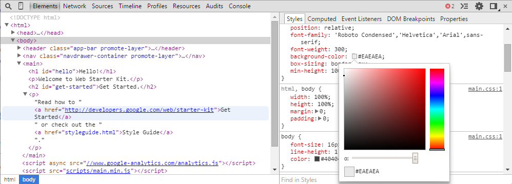
Google Chrome is one of the most popular web browsers used today by many people on desktop and mobile devices. It is also the favorite web browser for many web developers because of the exceptional Chrome DevTools for development and debugging of websites. Danny Markov from Tutorialzine has written an excellent article highlighting 15 must-know Chrome DevTools tips and tricks for web developers. Some of the features I really like from the list are:
Go to line
Easily jump to any line in Sources tab file.
Use multiple carets & selection
It allows you to write in many places at once.
Pretty Print
Easily transform minified files to a human-readable format.
Force element state
Easily activate CSS states such as :hover to ease styling process.
Play PAC-MAN in Google Maps
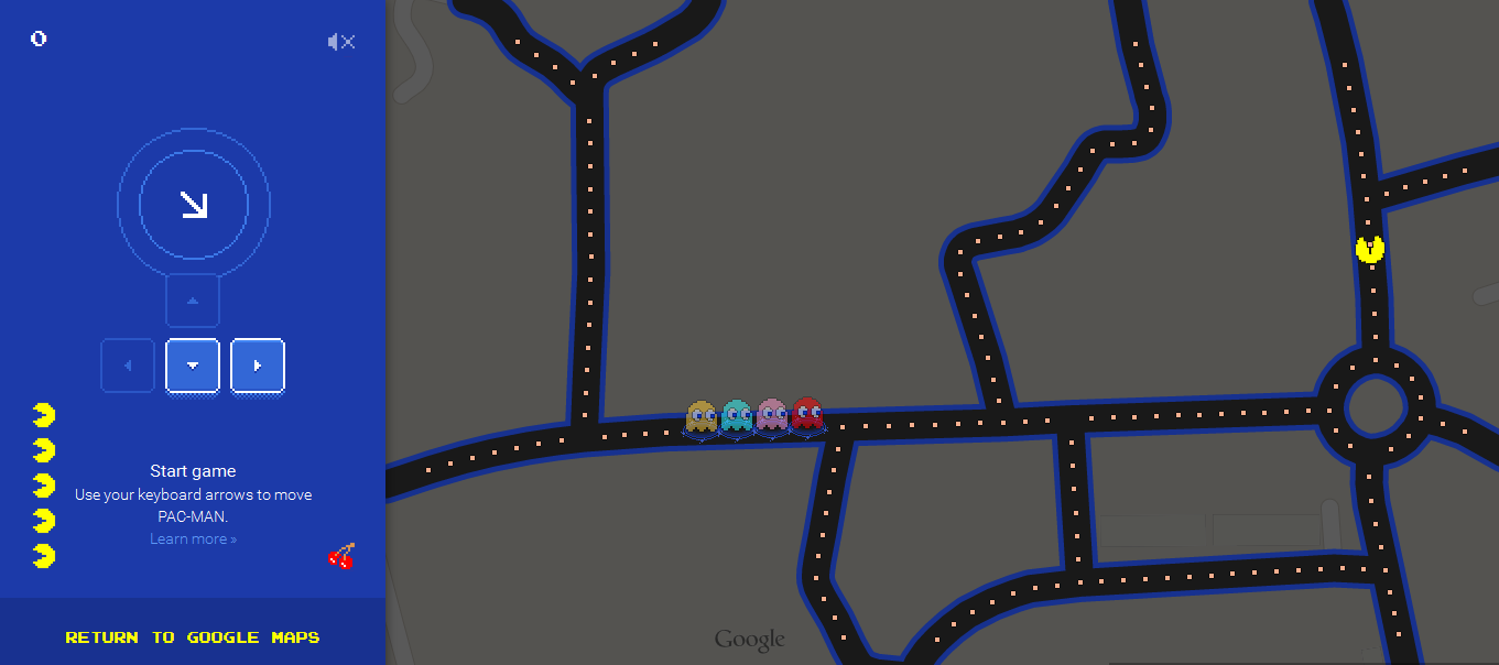
You can now play the classic arcade game PAC-MAN in Google Maps and choose your own streets as the game maze! On desktop, simply go to Google Maps, pick you location, make sure to zoom in to street-level and look for the little box in the lower left corner of the map to launch the game. The game is clever enough to detect if the road network in a particular area is not well-suited for the game. Cities and town houses road networks make the best maze. You can also play on mobile however there are limited places that you can choose for the maze. This game is only going to be around for a while so don’t miss it. Hit the buttons below to try the game or view the official help page.
Lightcase.js Responsive Lightbox
Lightcase.js is a jQuery lightbox framework created by Cornel Boppart that allows you to present various media formats on your website. The highlight of lightcase.js is how it beautifully displays the lightbox in a responsive website such as when using a phone. This amazing plugin uses CSS3 for all its transition and works fine in all common browsers such as Chrome, Firefox, Opera, Internet Explorer 9+ and more. It has an extensive set of configurations and a fairly flexible API. The only minor bug I spotted at the time of this review (version 2.0.3) is when you do a drag motion in the lightbox on content such as Google Maps, the slideshow moves to the previous or next slide depending on the direction you are dragging. I am sure it’s a quick fix for the developer. Hit the button below to learn more.
CSS SANS – Build Fonts Using CSS
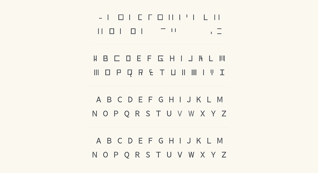
CSS SANS is a set of letters from A to Z build using CSS or in other words a font created by CSS3. It is a joint work by Yusuke Sugomori and Masanari Kakamu to give us a glance on the unprecedented history and evolution of web technologies such as CSS and web browsers. When viewed on traditional browsers such as IE5 or IE8 that only supports CSS1 and CSS2 respectively, one can see the imperfection of the rendered letters especially on the CSS1 browsers. Although it is not something you can use on a production website, CSS SANS certainly shows us how far the web has come in the last two decades.
Flickity – A Responsive Flick-able Slider
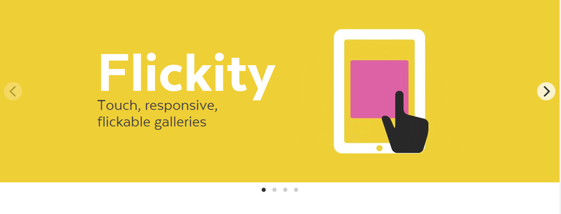
Flickity JS is a responsive, touch-enabled carousel plugin with a huge options list and a flexible API. Beside working like a normal carousel with pagination and left/right navigator, it allows user to flick the slider to navigate between the slides. It can be run as a jQuery plugin or on its own. Below is the basic HTML structure for a Flickity gallery:
<div class="gallery js-flickity">
	<div class="gallery-cell"></div>
	<div class="gallery-cell"></div>
</div>
You can also read David DeSandro, Flickity developer post on CSS-Tricks to learn more about Flickity. Note that Flickity has three kinds of licenses which are open-source, commercial, and OEM. Hit the button below to learn more and view some of the demos.
Flipside – Button Flip Transition
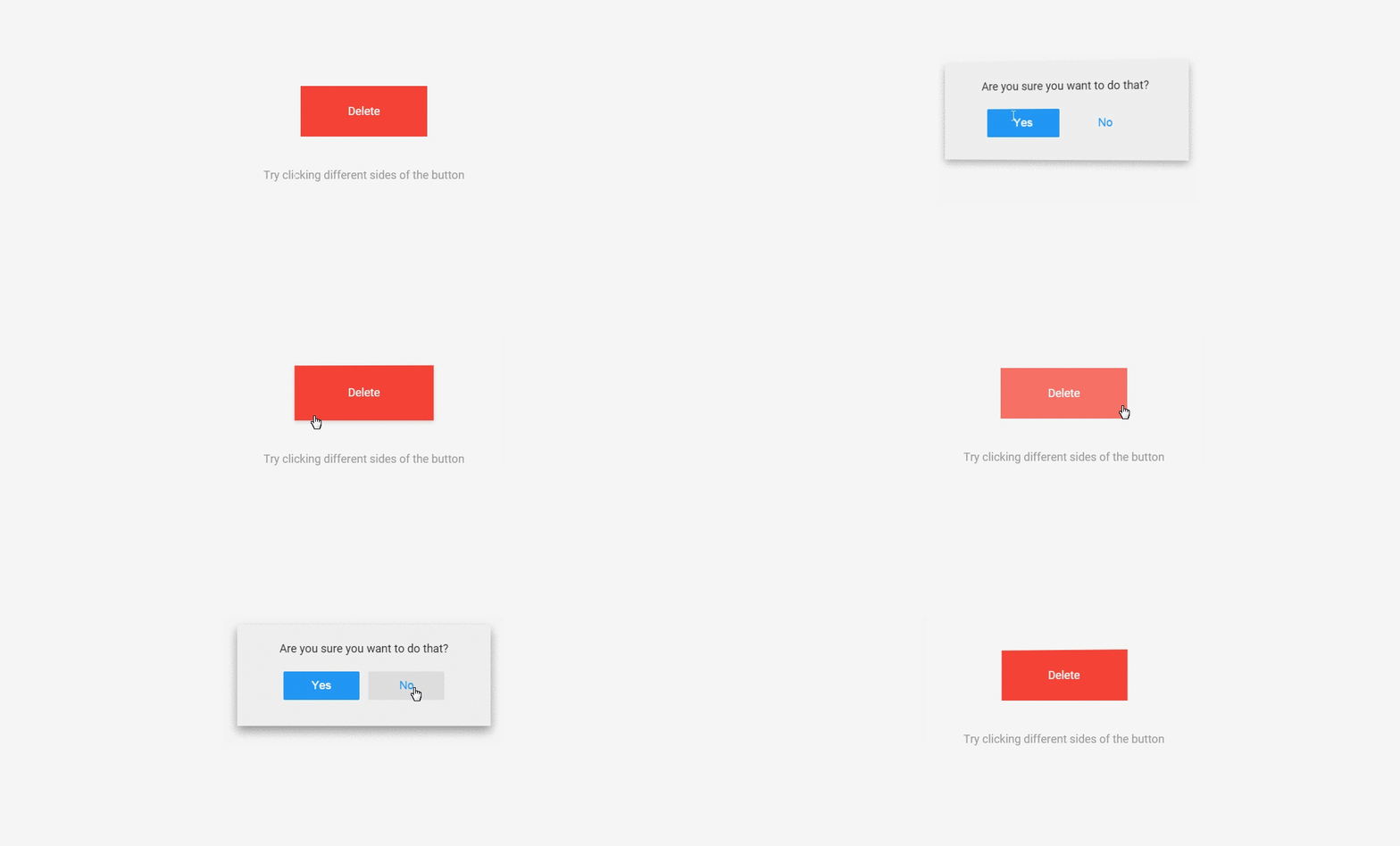
Flipside is a nice, little UI concept for buttons interaction created by Hakim El Hattab. The first cool part is the seamless integration of the confirmation prompt as soon as user clicks on the action button. The second cool part is the subtle details in the button flip transition. Take a look at the demo. Did you notice that the button flip direction depends on which side of the button you are clicking? For example, if you click on the left side, the left side of the button will be pushed back and the other side will appear from the right. The continuity of the effect can also be observed when closing the confirmation prompt where the previous flip effect is simply reversed to reveal the main button for a more natural feel. Hit the buttons below to try the demo and view the codes.
 Stampede Design