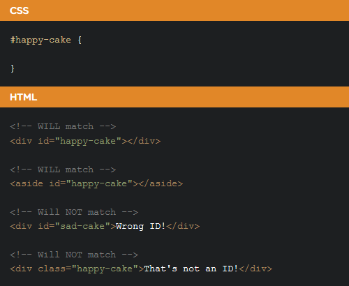
The biggest key to understanding CSS is understanding selectors. Selectors are what allows you to target specific HTML elements and apply styles to them. Suitable for beginners in the web industry, Chris Coyier from css-tricks has published an article about understanding how CSS selectors would work. This article covers, among others – what the available selectors are, how to choose and use selectors in right way. Hopefully you’ll find it useful!
All posts by “Sani Halid”
Accordion Menu With Sliding Tiles
In my previous posts, I have already shared 2 posts about a number of demos and tips on creating an accordion menu. This time, I would like to share a demo of a sliding tiles accordion menu, a brilliant experiment by Wifeo. The logic behind this demo is actually quite straightforward. The tiles each respond to mouse over and slide to the sides to reveal text corresponding to the active tile. Wifeo achieved this through CSS visibility property to show and hide the text and transition for sliding the tiles on hover. Try it out!
Side Hamburger Menu With Animation
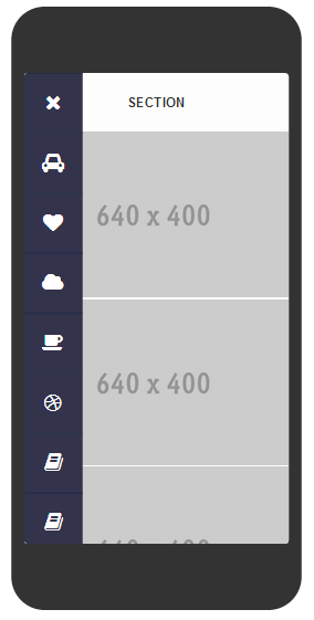
Nice demo by Gianmarco about creating animated side hamburger menu with a number of categories to choose from. Users can click on the hamburger icon for the menu appear and click “x” button to close the menu. However, this feature currently fully works in Chrome only, while it may seem lagged for the other browsers.
JavaScript VS jQuery
Many aspiring web developers want to know what the differences between JavaScript and jQuery actually are. While both start with a J, there are also a couple of other similarities as well. It may surprise you to learn that JavaScript and jQuery are actually the same thing – jQuery is a set of JavaScript libraries that have been designed specifically to simplify HTML document traversing, animation, event handling, and Ajax interactions. That said, in order to use either one of these scripting languages you need a solid foundation in JavaScript.
In this brilliant article by Bryan Wilde, you will learn further what JavaScript is, what jQuery is, their differences – JavaScript vs jQuery and which scripting language is the better choice for your future web development projects.
CSS: Text Select Effect
Usually when the user selects a text or the whole paragraph, a highlighted effect will appear with white background along with the font highlighted in blue, or any other colours for that matter. With this feature from Ahmad Anas codepen demo, highlighted text select effect will be replaced with transparent outline font by using CSS. Unfortunately this feature is only available for Chrome and Safari for now.
CSS: Candybar Progress Button
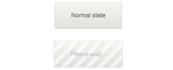
The spinning animated gif is a very common UI element for showing loading state in website interactions. In this tutorial, Cemre Güngör shows a cool alternative candybar loading animation that can be applied on buttons. To see how he creates this progress button, click button below.
#TGIF: Awesome Workstation
UI Idea: Icon Filling Effect
Icons are commonly used in user interface to communicate a message quickly and to support textual content. When done right, it serves more than eye candy and actually helps readers to maintain eye tracking as they scroll down a website. But what if we can produce icons with effects that transcend their usual static properties? Inspired by the cool icon filling effect of vertical timeline on Elliot Condon’s website, Sebastiano Guerriero from codyhouse showed us how to achieve the same effect with a little help from transparent icons. Though it requires some advanced CSS techniques, it’s worth to learn and is perfect for one-page website. Using this icon filling effect, you are now able to piqué readers’ interest and guide them from one section to the next. Well done, Sebastiano!
JavaScript: Rainbow Spider
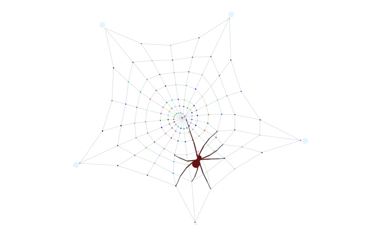
This almost life-like little spider is created only by using Javascript. Let’s see how Dave Alger created this hyperactive creature in Codepen. And don’t forget to play with the spider web. Hopefully you are not arachnophobic :)
Loading UI Inspired by Call of Duty: Ghosts
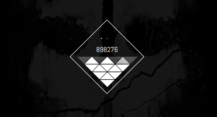
It does not always happen these days – but it would have been frustrating waiting for a website to load its content. If it is unavoidable for your website, try this: create some cool UI or animation to ‘entertain’ users while waiting for the loading to be done. 2NE has created a cool loading UI demo with a Call of Duty game concept. What are other impressive loading interfaces you have seen?
 Stampede Design