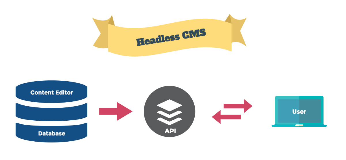
Before the smartphone era, web development was simple. All it took was to make it look perfect on 1024px width for example. At present, there are more variables that needs to be taken into account. The screen size of devices, and whether it needs to be built with HTML or natively for an app (Android, iOS, Windows). Responsive CSS answers the question on the ‘size of the device’ but not the other. Headless CMS gives you an API that you can use for websites, native apps, widgets and other. This comes as a difference compared to the traditional method of just showing the data up front. For example, WordPress is a regular CMS, but with WP Rest API, it can be a headless CMS.

comment 0
 Stampede Design