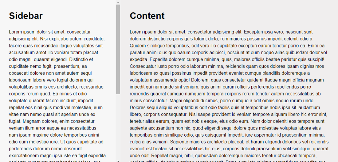
Tuts+ contributor Cory Simmons has written a cool tutorial on how to create responsive scrollable panels with flexible box or Flexbox. Flexbox is a CSS box model that allows children of a flex container to be laid out in any direction, and can “flex” their sizes, either growing to fill unused space or shrinking to avoid overflowing the parent. Here are the general idea of the whole markup:
HTML
Make sure to wrap your entire page in a container.
<div class="wrap">

  <main>

    <aside>
      <h1>Sidebar</h1>
      <p>
        lipsum...
      </p>
    </aside>

    <article>
      <h1>Content</h1>
      <p>
        lipsum...
      </p>
    </article>

  </main>

</div>
CSS
html and body are given height:100%. The .wrap is also set with display:flex to give the child elements access to flex property.
html, body {
  height: 100%;
}

.wrap {
  height: 100vh;
  display: flex;
}
Make it Flexible
Set flex property and value to main, aside and article. To make aside and article scrollable, set overflow-y: scroll. Otherwise, the whole page will be scrollable just as a usual website.
main {
  flex: 1;
  display: flex;
}

aside, article {
  overflow-y: scroll;
  padding: 2em;
}

aside {
  flex: 1;
}

article {
  flex: 2;
}
Hit the button below to read the full tutorial.
 Stampede Design