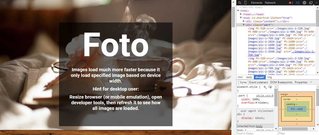
Foto is Javascript library that helps you load different images on different screen widths on your responsive website without using CSS media query. It’s also an alternative for srcset to load responsive images. Foto is easy to use, has no dependency and zero configuration. To use it, you just need to include foto.js inside your HTML and put ft-(number-pixel)-src on img. For example:
	<!DOCTYPE>
	<html>
		<head>
			<title>Sample website</title>
			<script src="path/to/foto.js"></script>
		</head>
		<body>
			<img
				ft-320-src="image-for-320px-screen-width.jpg"
				ft-480-src="image-for-480px-screen-width.jpg"
				ft-640-src="image-for-640px-screen-width.jpg"
				ft-768-src="image-for-768px-screen-width.jpg"
				ft-1024-src="image-for-1024px-screen-width.jpg"
			>
		</body>
	</html>
Hit the button below to read more and view some demos. To learn more about using srcset, click here.
 Stampede Design