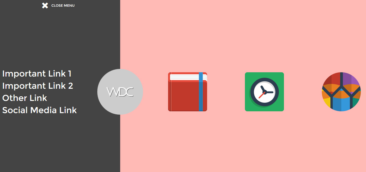
Getting bored with the usual sliding hamburger menu? Give it a little facelift by applying a closing door menu effect. Instead of having half of the page covered by the expanded menu, the new menu style has two panels sliding in from opposite ends of the screen covering the whole screen. You can take advantage of the extra space by adding interesting elements such as a company logo, featured product icons or a bigger menu. The effect is achieved using CSS3 transition with a little help by jQuery to control the z-index of the panels.

comment 0
 Stampede Design