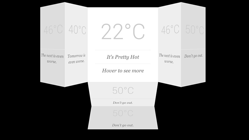
Once in a while, someone came up with a mindblowing solution to an interface problem. How exactly do you design an overload of information to avoid from overwhelming your reader? Pete from onextrapixel has created Flip Out Cards – a jQuery plugin that lets you display more information by flipping out extra cards without consuming much space. In essence, the plugin gathers all the cards, group them together based on the direction defined (left, right, bottom, and top), position them correctly and hide them out of view. All animations are driven by CSS3, so you could also manipulate class names based on the flip sequence preferred.
My favourite is demo #5, where the card expands in all directions on mouseover. Cool stuff.
 Stampede Design
1 Comment so far