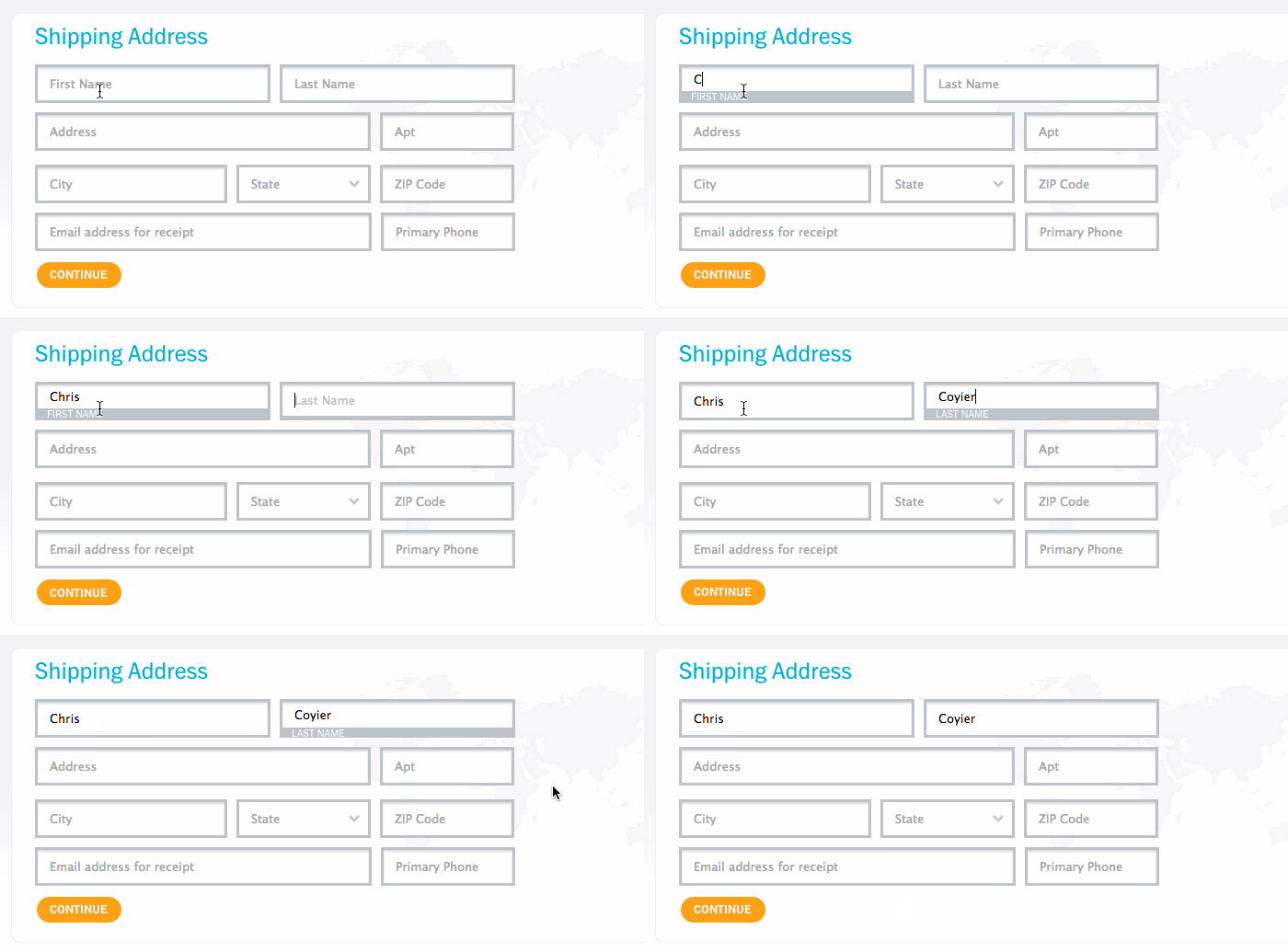
This highly useful technique helps user to remain informed when filling a form while taking less screen space, especially on mobile (read Brad Frost’s article discussing the pros and cons). From a design perspective, it is cleaner and space-efficient compared to having labels separate from their inputs. Thanks to Chris Coyier, a better form UX through label floating can now be done in pure CSS.

comment 0
 Stampede Design