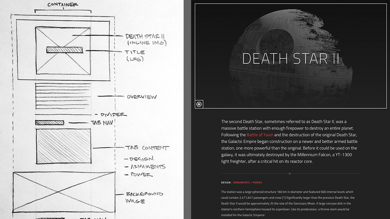
Optimizing CSS for many types of screens, and nowadays responsive is a must in any web or app development. This is to ensure the user experience is great in any viewport. Usually Front-end Developers (FEDs) will work on mobile, tablet and desktop screens. But what about Giant Screens? which are at least 2560×1600 pixels.
Most of the sites online are not optimized for this scale: text is too small, the volume of content packed into a relatively small space makes it difficult for the eye to know where to focus. Jon Yablonski has recently worked on this large display and wrote an article for CSS TRICKS . Useful tips from him!

comment 0
 Stampede Design