 Stampede Design
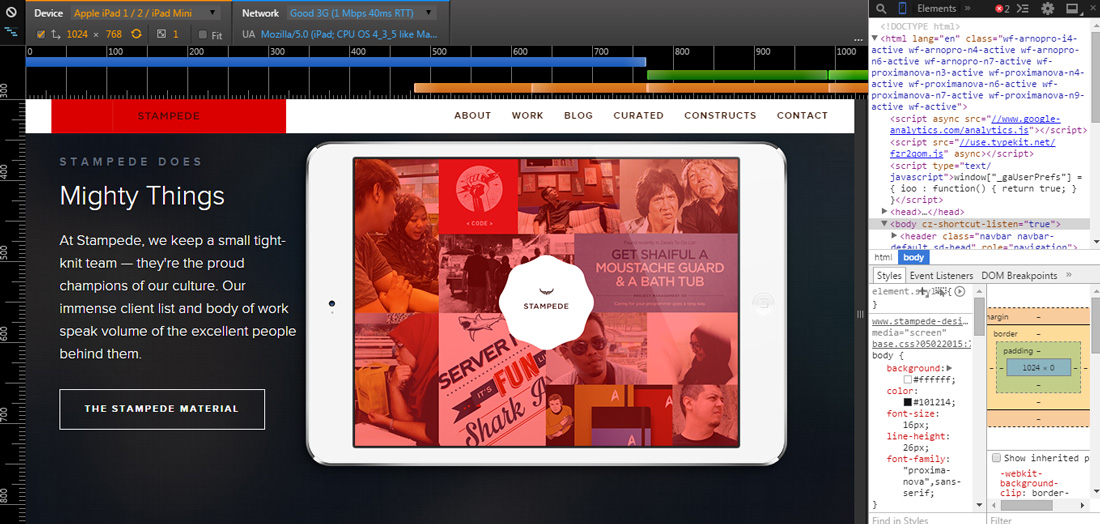
Part of the challenges in developing a responsive website is the testing phase that have to be conducted on devices with many different screen sizes. Of course the simplest approach is simply by resizing the browser size to match the viewport of certain smartphones or tablets. The disadvantage of this method is you cannot truly emulate the unique mobile touch interactions like swipes and pinch to zooms. Fortunately, Google Chrome DevTools has a feature called device mode that’s loaded with helpful tools for testing and debugging responsive designs. Here are the main features of device mode:
- Mobile device emulation
- Touch events emulation
- Media queries inspector
- Mobile network simulation
Hit the button below to learn more on how to test responsive websites in this article by Jacob Gube from Six Revisions.