 Stampede Design
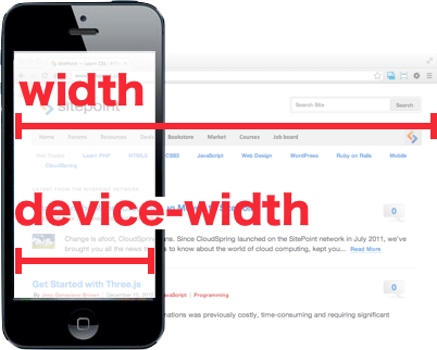
If you are new to the world of responsive website development, you have probably seen at least the most basic media query expression using width. Besides width, there is also device-width which expands to min-device-width and max-device-width. Although it’s unlikely that you are going to use device-width, it is important to have a good understanding about the difference between width vs device-width. For a rough idea, take a look at the main image used in this blog post above. For a more detailed and technical explanation, check out this Sitepoint article by web developer Ryan Reese as he attempts to shed some light on this topic accompanied by simple code demos. Hit the button to learn more.
comment 0