 Stampede Design
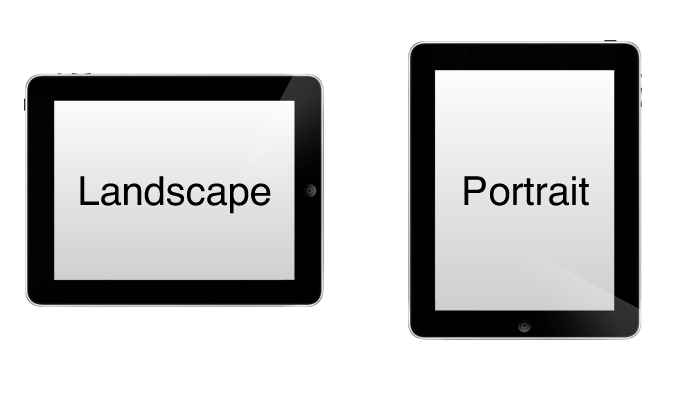
Media queries are the building blocks of responsive websites. They work by allowing front-end developers to style a website based on conditions such as screen size, orientation and resolution. In this Sitepoint article, web developer Ty Strong shares a wide range of media query features and ways to construct media query with multiple conditions. This article is a great read for anyone just starting out with responsive web development as well as the pros who may not be aware of some of the media features that exist today.
comment 0